The Invisıble Dot
Pun
Intended
Comedy is a big deal in the UK. Especially during the early 00’s, when an industry boom saw new acts coming through and established comedians reaching celebrity status. The Invisıble Dot started as a company interested in the margins of the industry, the comedy that was not on television or selling out arenas.
Our collaboration started in 2009, when the company was about to open in an upstairs room of Camden Stables Market. The office doubled up as venue, in the evenings the tables were put aside and a stage fitted to host a small audience.
In those days, this reduced scale was very much part of the spirit of the company. There was no signage at street level and no widespread advertising effort, the Dot spoke to an informed and knowledgeable public that would make the effort to come and find it.
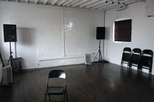
First venue, Camden Stables Market
It was not exactly secretive, but it was a strange animal in the world of comedy. Part venue, part producers, part creators, the Dot could spring up in unusual places with performances or installations of its own making: a three-sided football tournament, phone cabins playing short stories, a late night jazz club, a 12” album of poems recorded in a boat (with a string quartet).
It would have been a shame to brand this idiosyncratic collection of activities with a stiff, constrictive identity. There was no logo, to begin with. Instead, we just removed one of the dots on the i’s: The Invisıble Dot. It could, and probably did, go unnoticed for most people, but so did the venue in Camden. Like most of the Dot’s early material, it takes a knowing eye to see it.
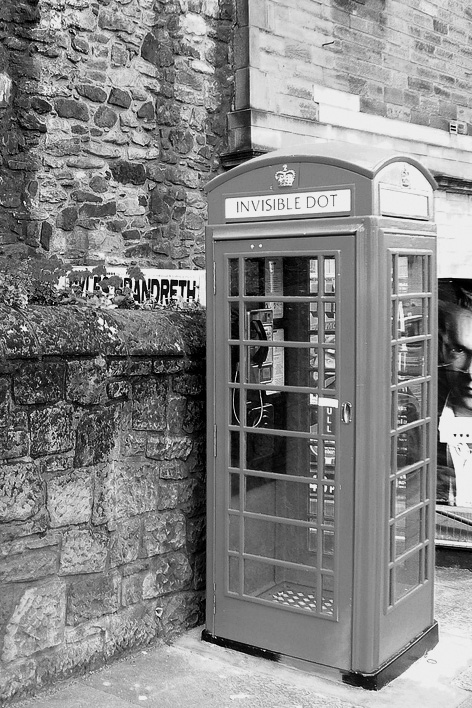
The Invisible Dot phone box in Edinburgh
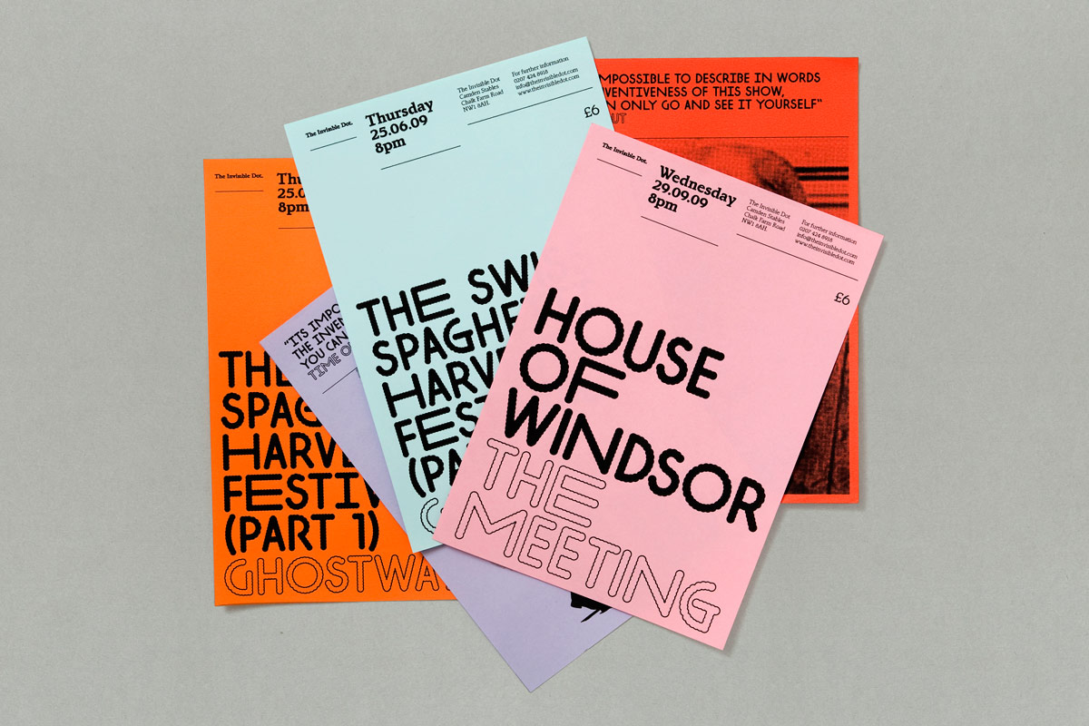
That said, the Dot needed to advertise its performances, and it needed to do so quickly and cheaply. A comedian could be confirmed only on the day before the gig, so there was little time to produce bespoke graphics every time. Regardless of that, the company was keen to print posters. This left us the challenge of having to turn around a piece in low quantities, little time, and little budget.
It made sense to use Risograph printers, as they are ideal for short runs. But they also come with their own distinctive characteristic, namely low resolution when compared with offset, inkjet or laser. They preform well with small blocks of flat colours; they can struggle with detailed shapes and photographic reproduction.
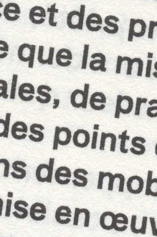
Risograph print detail
It helped immensely that the Dot agreed in not using portraits of comedians in their communication. Comedy is littered with posters of performers pulling a befuddled, ‘funny’ face, a visual status quo that is incredibly conservative regardless of how much effort the comedian makes in looking out of sorts in the photograph.
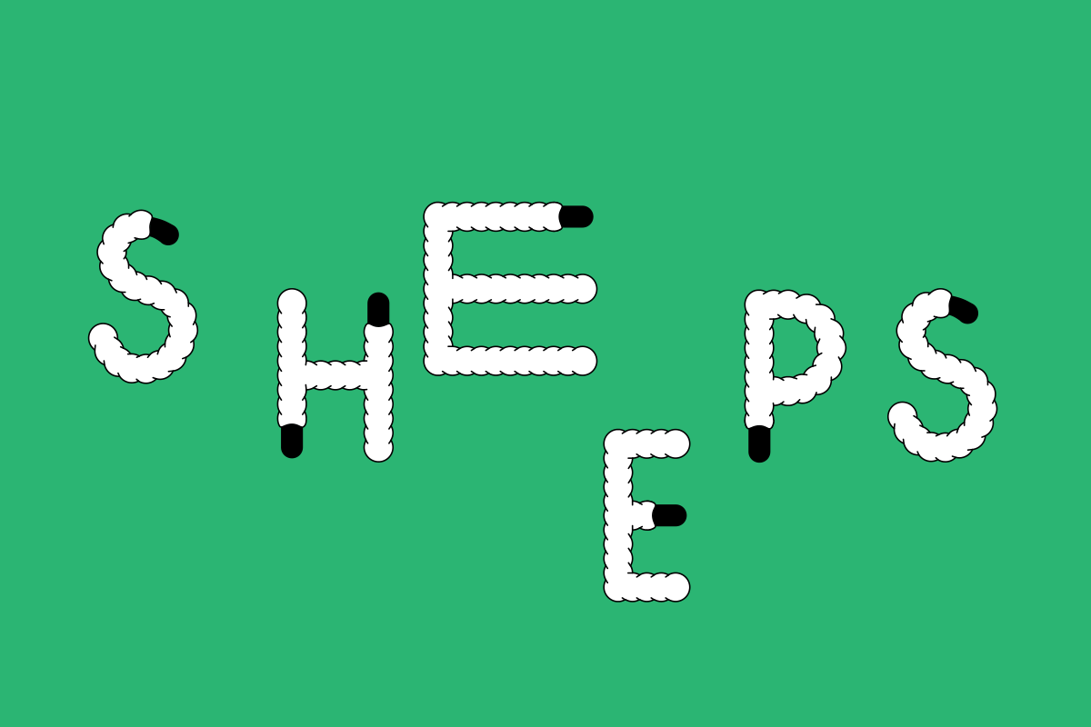
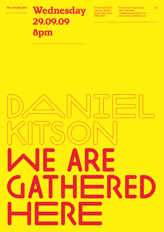
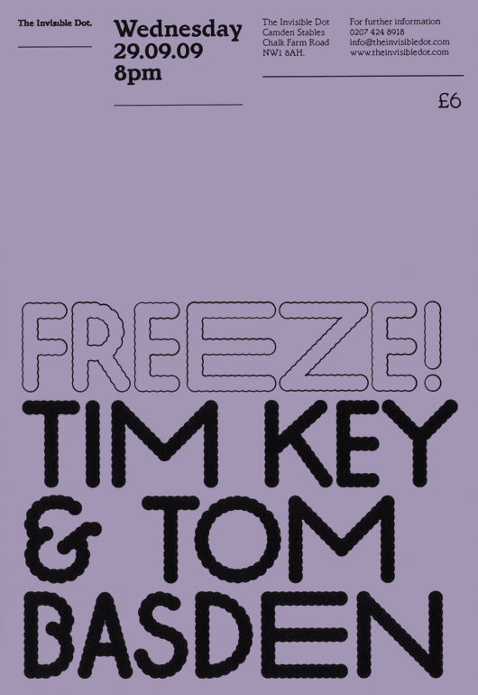
The Dot’s posters were going to be typographic. Obviously the idea of not looking like other comedy posters was appealing, but there’s more to this than just being different. Risograph would never give us the same result and cost efficiency if we printed images, to begin with. More than that, using only language we make the communication to be about concept, which was the company’s strength. Instead of an image it created a voice, one that could be applied to the many disparate pieces of the Dot.
Lorem
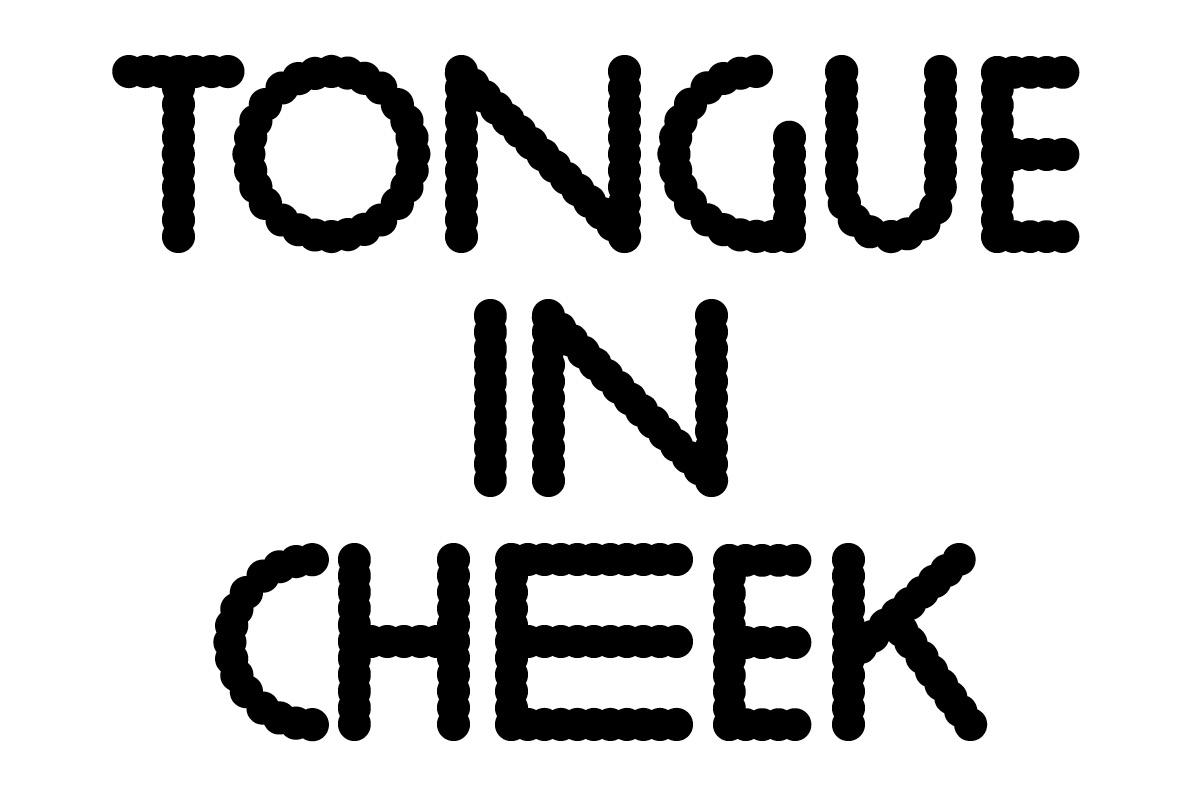
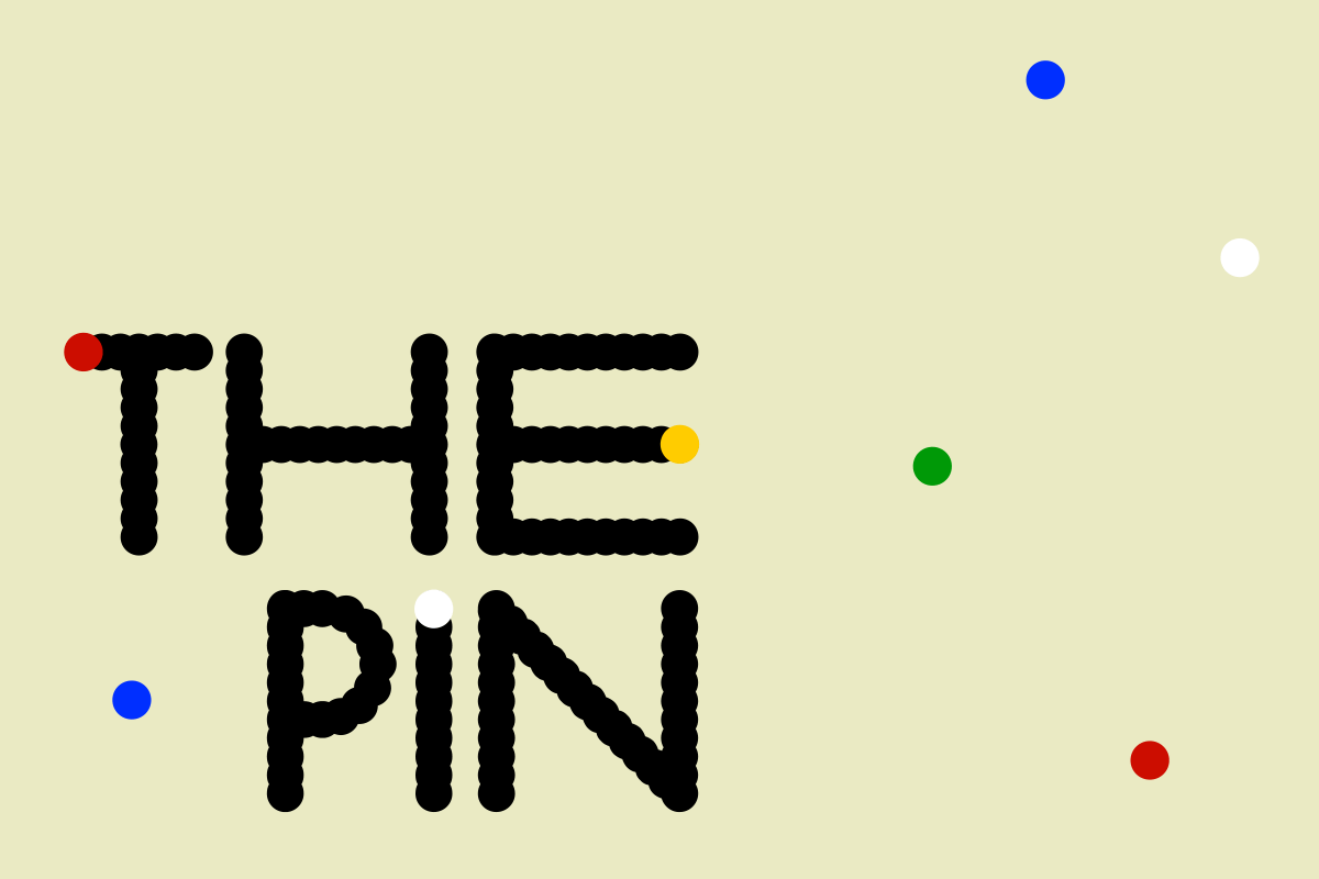
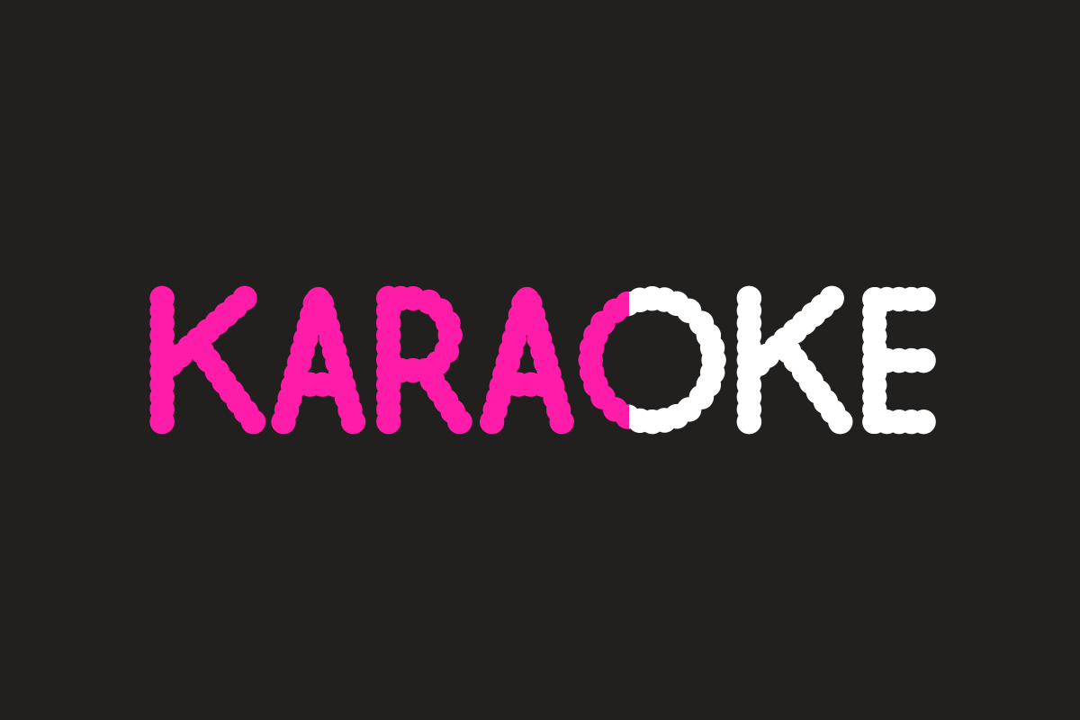
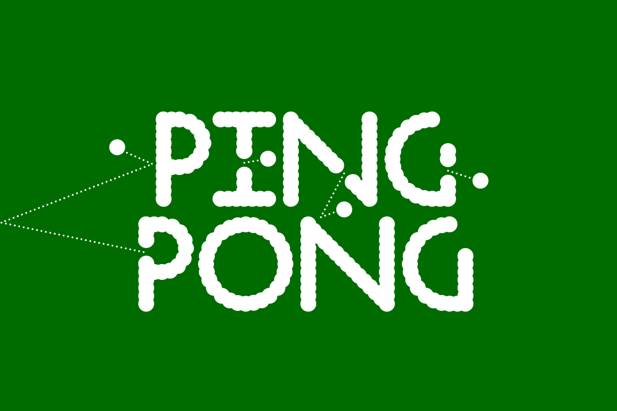
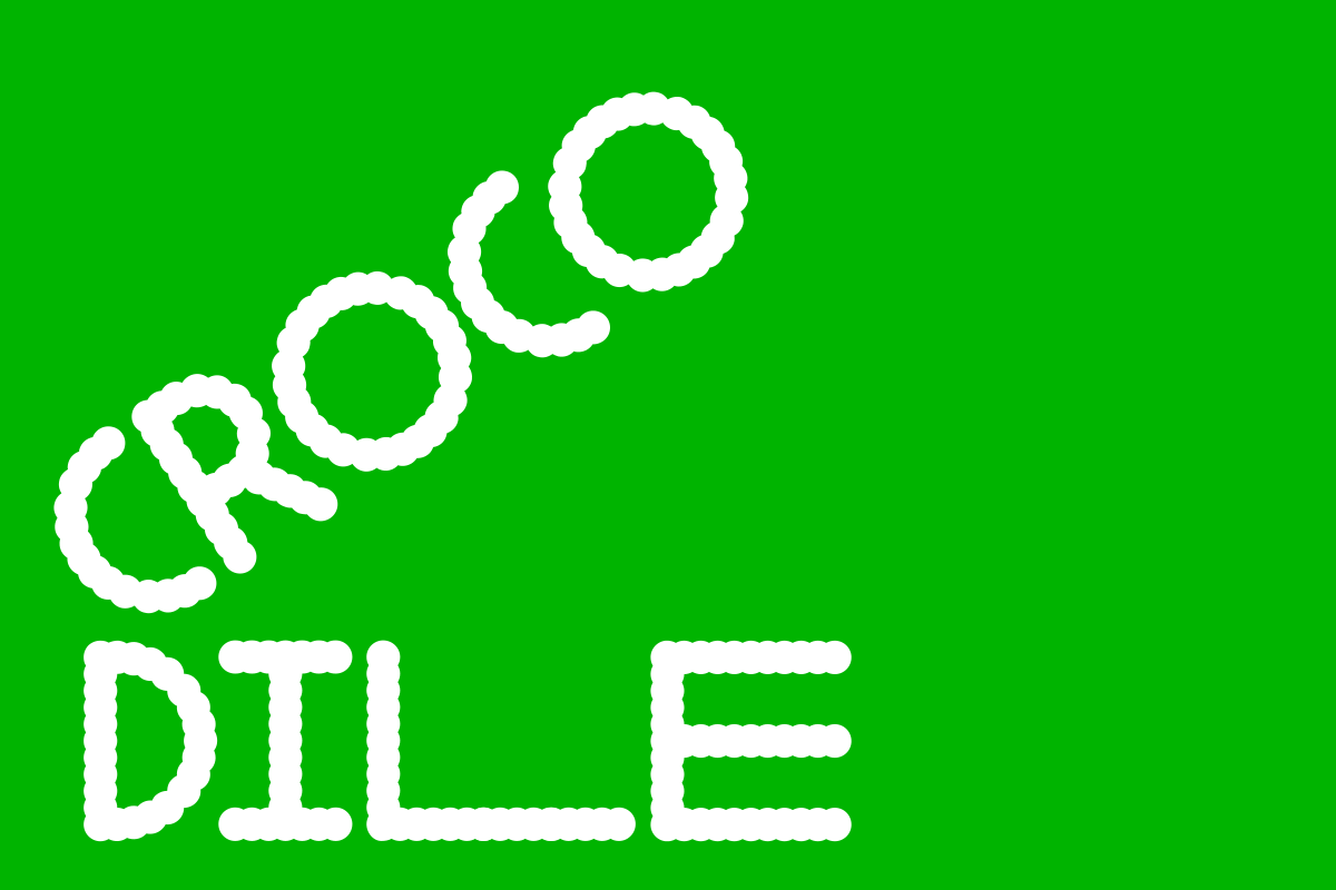
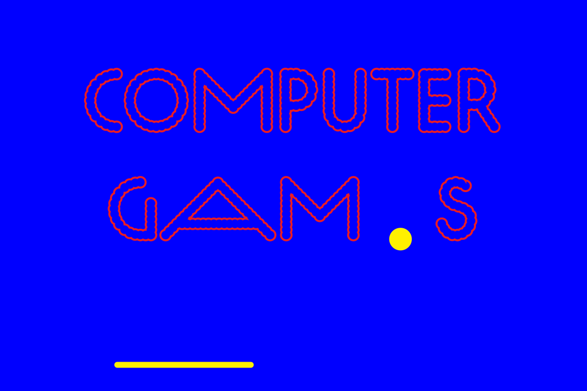
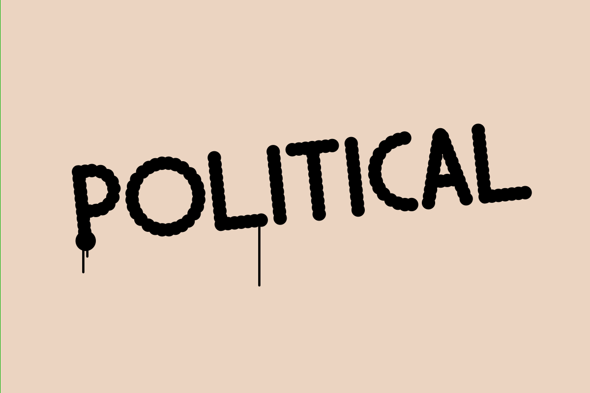
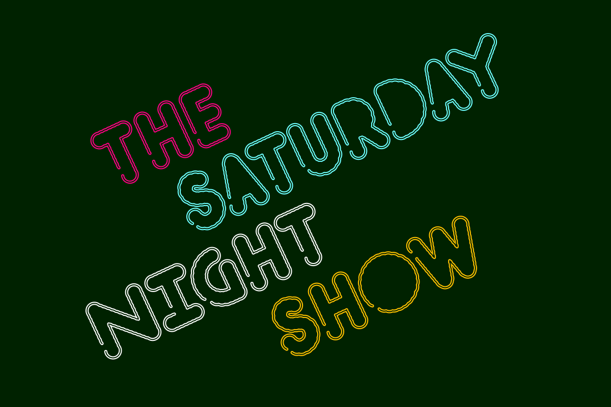
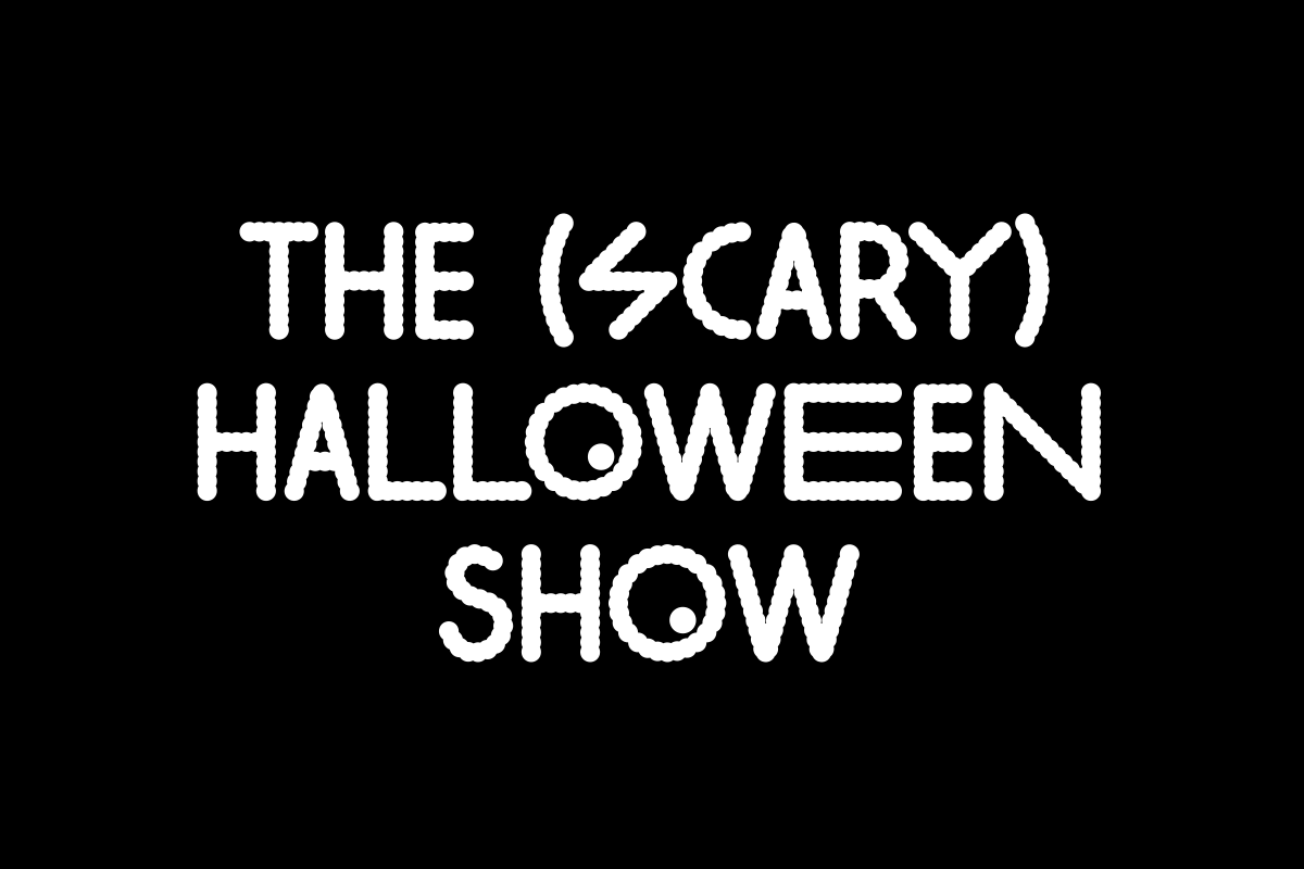
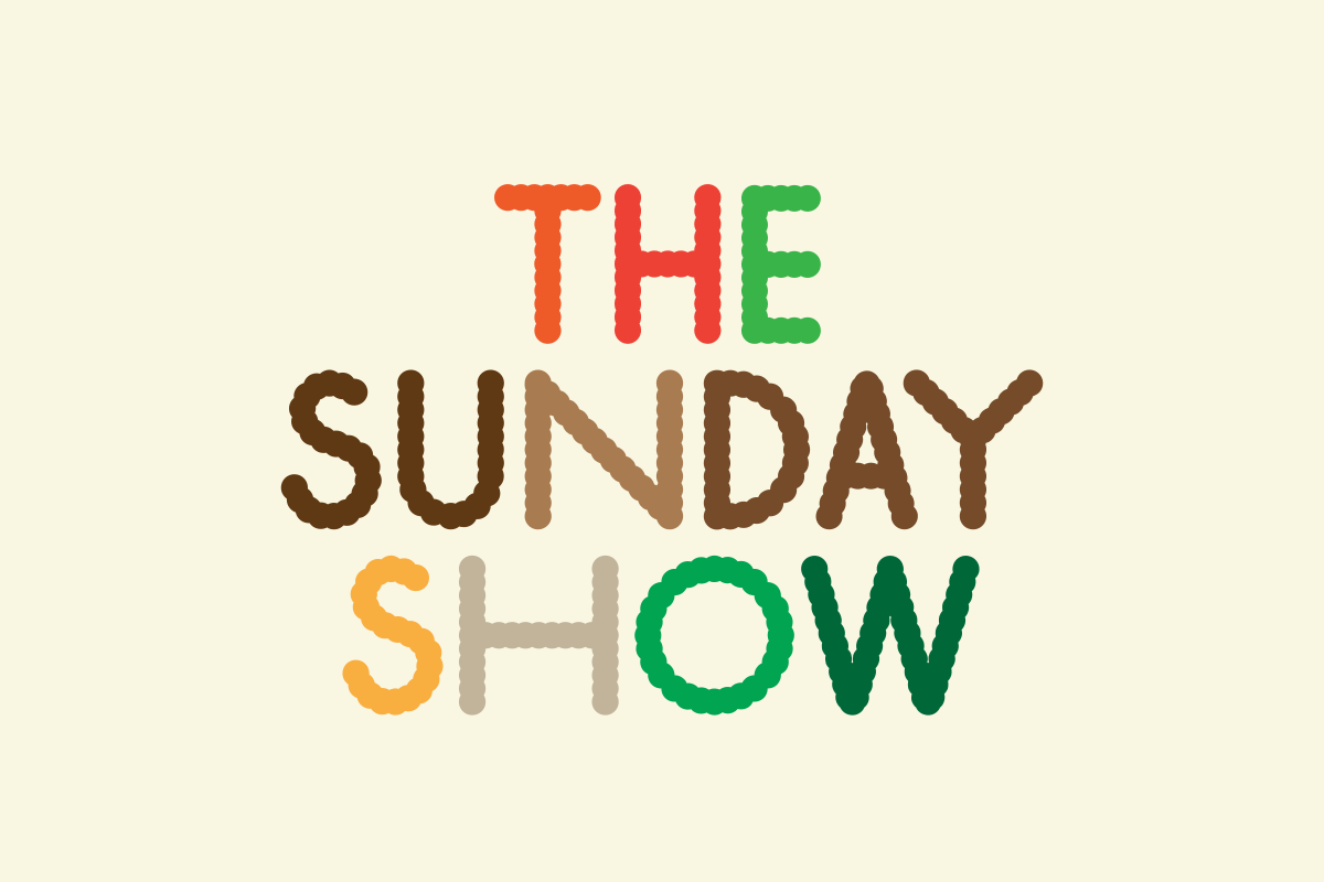
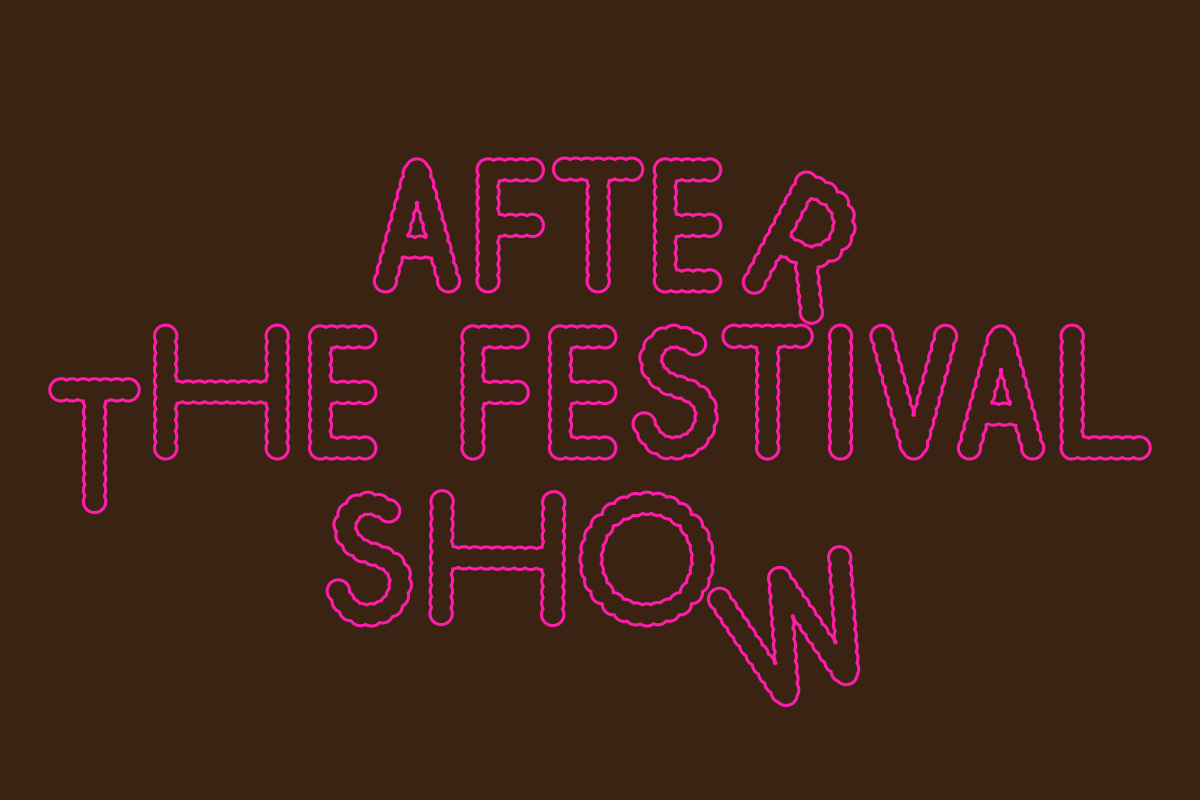
A typeface was designed to deal with the fuzziness of Risograph printing. The letters are made of dots, as if magnifying a low resolution print. This way the ‘error’ of the machine is incorporated into the object, so when the typeface is printed in smaller sizes the mistake is already in it. There would be no gain in printing in a more expensive machine, so the typeface helps us overcome the project limitations. It also means the texture of the printed object would be retained on digital applications. In an acknowledgement of the symbiosis between type and printing machine, the font was baptised ‘Riso’ (which means ‘laughter’ for the Portuguese and Italian contingent of Julia, but less helpfully it also means ‘rice’ to Valerio).
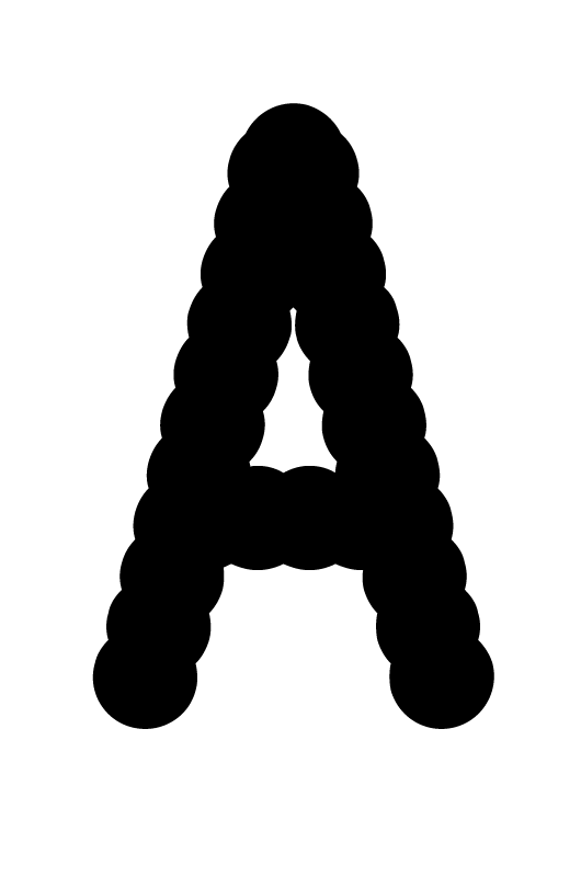
The typeface has letters with different widths to help typesetting in case lines are too short or too long. This made possible the creation of templates that could be filled by the Dot team. In case a poster needed to be created quickly, it would be done by themselves, meaning we had our communication set up to work in the requested low quantities, little time, and little budget.
The Invisıble Dot ’s success and reputation grew quickly, and before long the company set out a plan to develop into a much larger enterprise. It would move to a new address, taking over a whole building with more seating capacity, larger stage, a bar and rehearsal rooms. The volume of activity would increase beyond anything the small Camden room could take, hosting up to 10 gigs in a week.
In this new scenario, the website was to be redesigned as the main point of communication for new events. It should work as a notice board filled up with posters for upcoming events, which meant the artworks had to be less template-based as they were now going to live side by side in the same page.
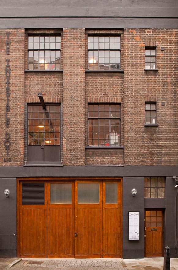
New venue in King's Cross
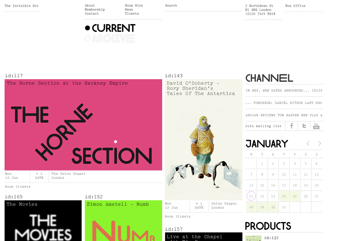
This became a job of inventing different ways of using the same identity over and over again, similar to our work for the ICA. Each week we’d receive a list of events and send back a graphic interpretation for them. It worked like a workshop, give us a theme, give us no time, one-second ideas, design, send back. It’s something we became better at, and most of times it was great fun to do.
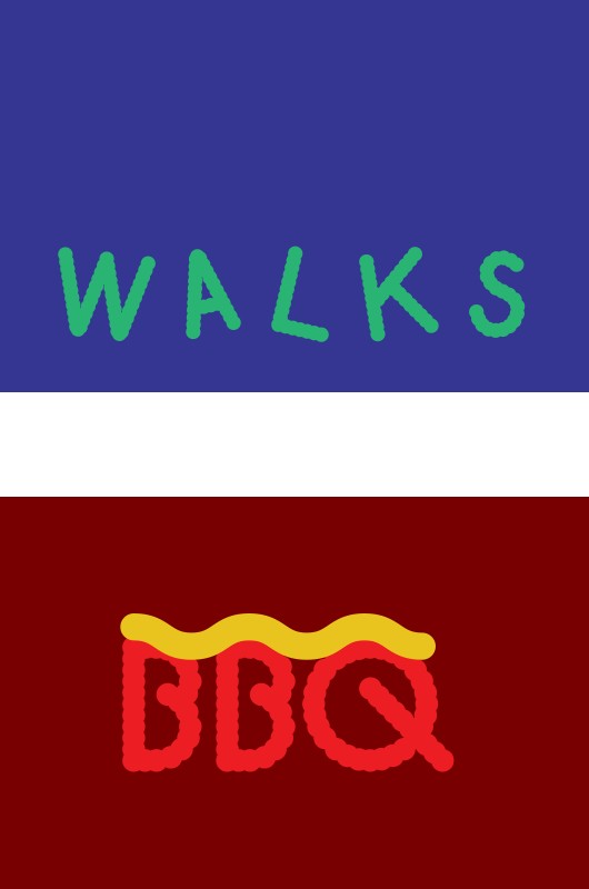
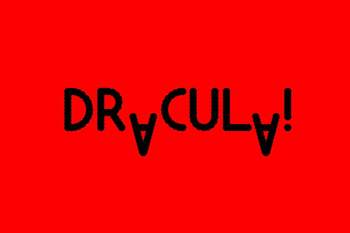
Throughout these years the Dot kept the original Riso typeface, though in this second stage we were more willing to interfere with it. It was taken apart, cut up and stretched. It became such a prominent part of the communication that it’s still in use, even though we’re now just friends of the Dot. Thankfully it was never picked up by a large brand and plastered across the UK high streets. That would have been a real joke, though not very funny.
