Copan
Letters to
Oscar
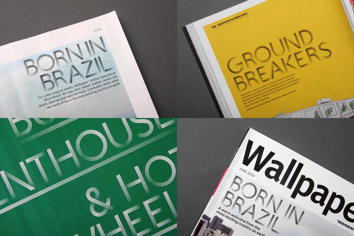
Wallpaper magazine first contacted us when preparing the Brazilian issue of their BRIC series (Brazil, Russia, India, China). They were interested in the fact one of us is Brazilian, and looking for a guest typeface to feature in the magazine.
The editorial line aspired to avoid clichés associated with the country, sidestepping the football-samba-caipirinha trinity. In the same fashion, the type shouldn’t be symbolic of an already established image of the country.
Below this surface of commonplace themes, things get increasingly more interesting: cordel, Gláuber Rocha, tropicália, Os Mutantes, bossa-nova, Caetano Veloso, modernism, vernacular grafitti, Chico Buarque, Ligya Pape, Oscar Niemeyer. The threads make up a complex place, but as they pile up the problem of how to represent this gets ever more difficult.
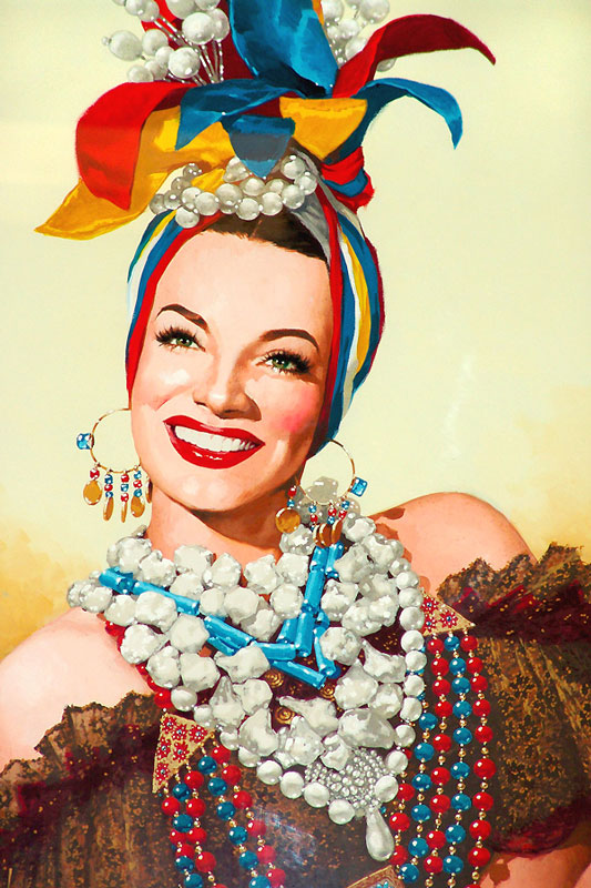
Carmen Miranda
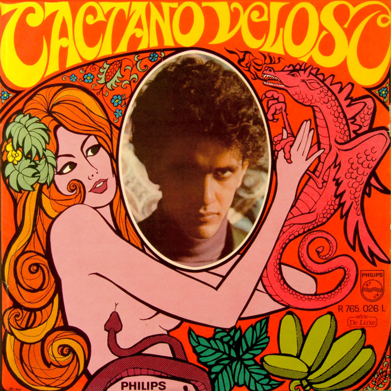
1/6Caetano Veloso
2/6Burle Marx
3/6Helio Oiticica
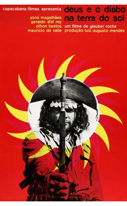
4/6Glauber Rocha
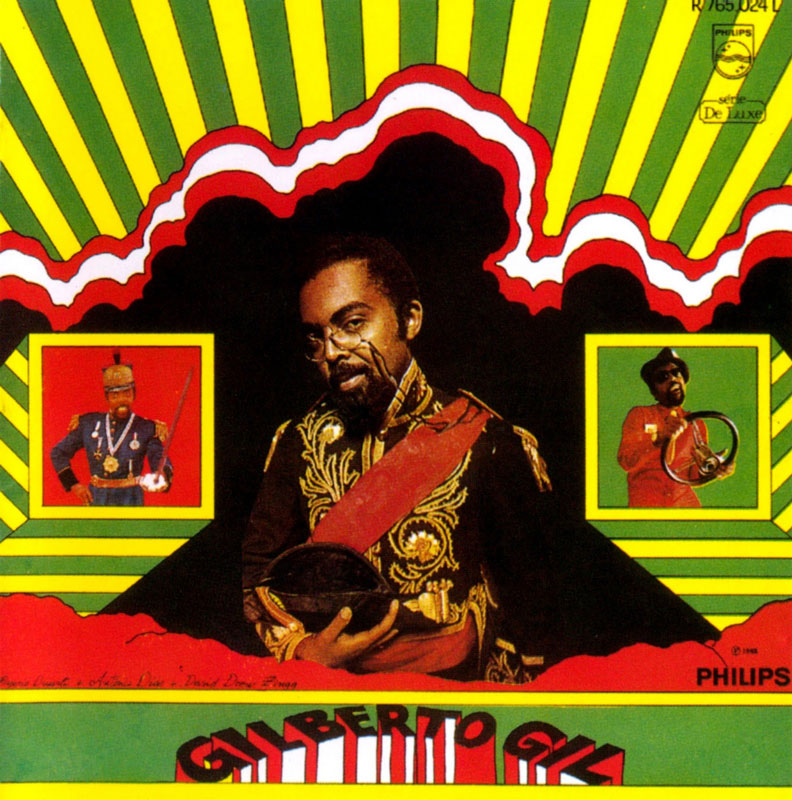
5/6Gilberto Gil

6/6Cordel
Perhaps trying to represent the whole of a country is the wrong approach. Choosing a certain angle breaks down the problem in smaller pieces, allowing us to pick the ideas that interest us the most and go from there.
One thing worth noting is that contrary to most European countries Brazil does not have an established typography history that we could refer to. It’s not that this is a problem or an advantage, it can work both ways, but it’s a different situation to be in when you’re designing a typeface. That being said, there are quite a few contemporary Brazilian typefaces that attempt to represent national identity. They usually derive from the vernacular, in the form of brush handwriting or grafitti in ‘pixação’ style.
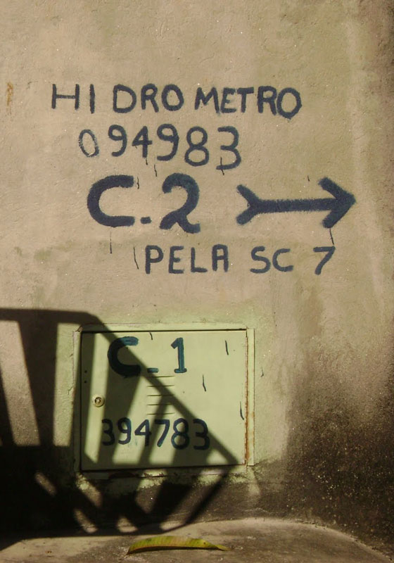
Vernacular typography
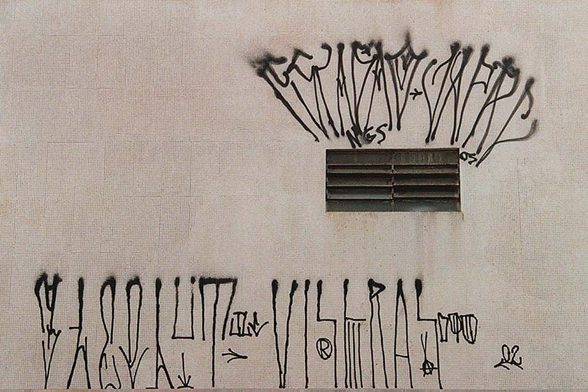
We felt that this wouldn’t be the right approach because, interesting as they are, examples like these conform to a point of view where local culture is valuable because it’s exotic. Moreover, the juxtaposition of a slick design magazine and Brazilian vernacular has a hint of favela tourism about it.
Once we were set on what we didn’t want the typeface to look like, we started drawing to try and visualise possible directions. In most projects we’ll only start this phase once we have a purpose, a north guiding the design process. In this case we thought it easier to think through images, drawing different alphabets and seeing what associations they create with the ideas we discussed.

Early sketches
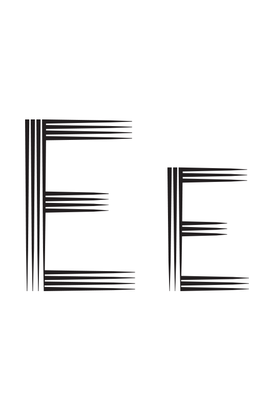
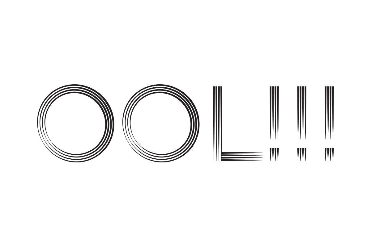
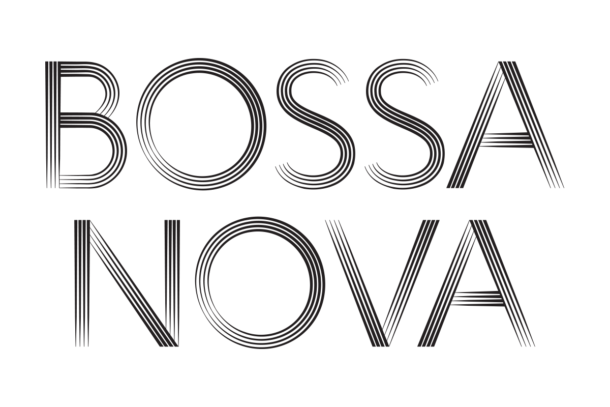
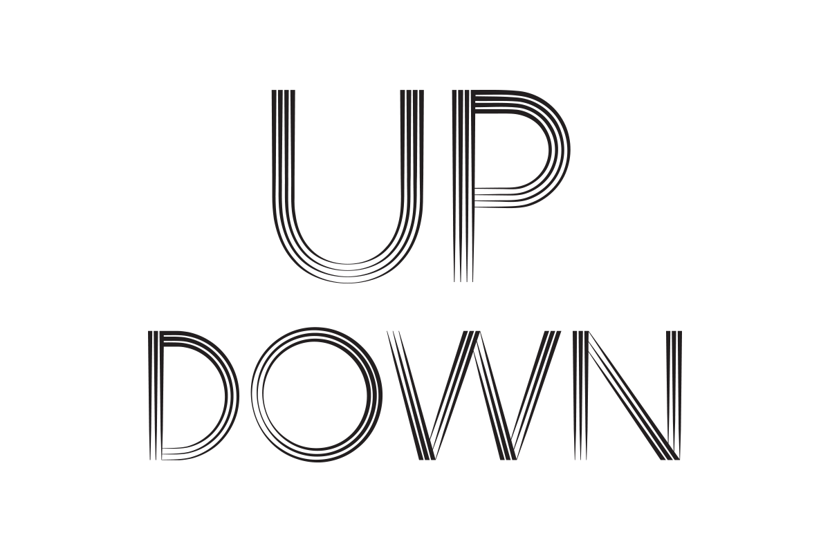
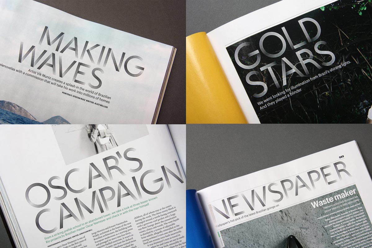
A common theme among these first designs was a leaning towards the pictorial, in reflection of the ornamental nature of much of Brazilian visual culture. Balancing this with more modernist ideas created promising results, and from these drawings came the route we selected to develop. It had parallel strokes reminiscent of brush movements applied to geometric letterforms.

An early sketch
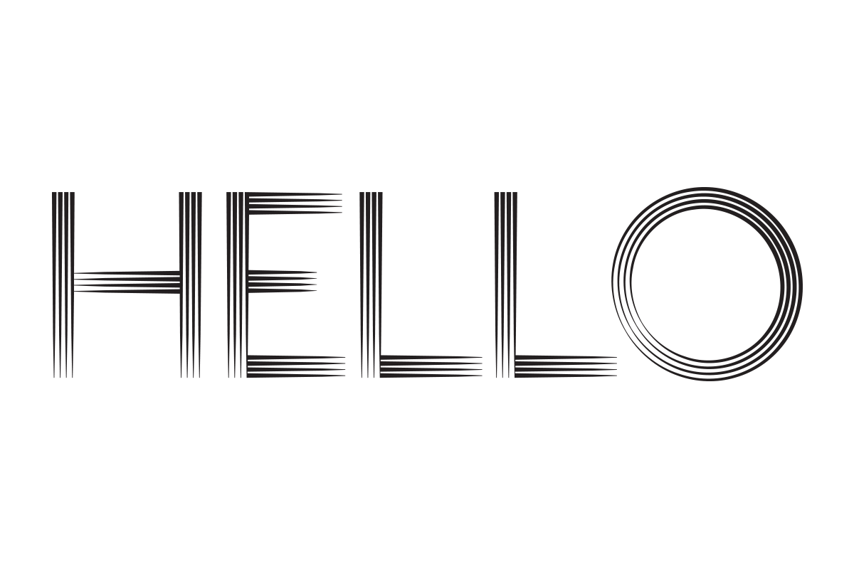
When testing the final design it was noticeable how the typeface changed in small sizes. The lines became indistinguisheable, looking like a gradient of greys instead. Even though this game of shades is one of the features of the type, we still wanted the lines to be visible.
To address this we worked together with the Wallpaper team defining the type sizes likely to be used on the magazine. The solution was to design a second version with one less parallel stroke to be used in small sizes. This means both versions have the same frequency when one is at 60% the size of the other.
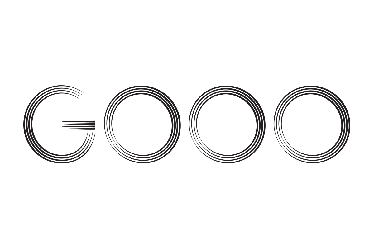
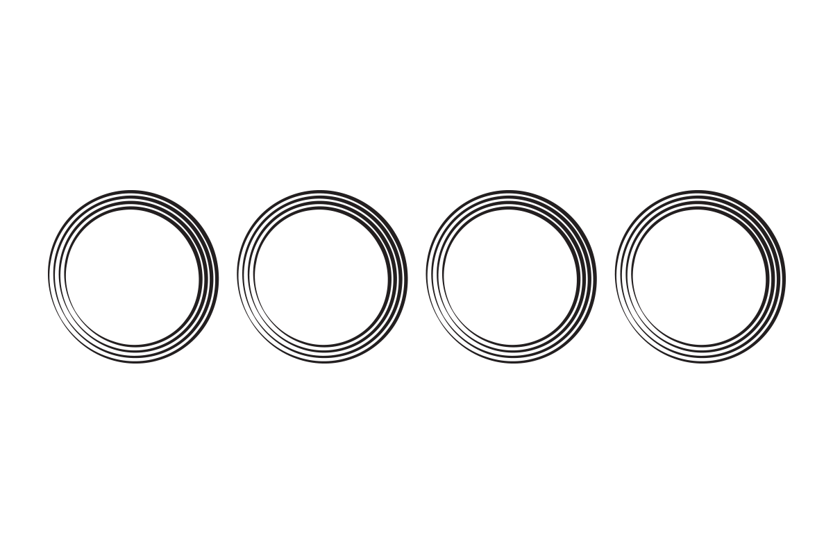
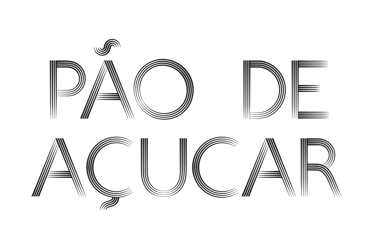
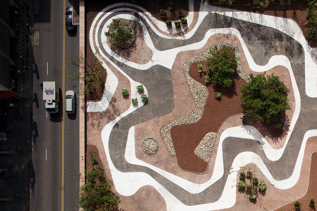
Once the basic design was in place, it was possible to see accidental associations. The Copacabana sidewalk is one that jumps to mind, but the most interesting one is a formal resemblance to the façade of Oscar Niemeyer’s Copan building. Its concrete brise-soleils create a visual repetition as it waves between other buildings in the centre of São Paulo.
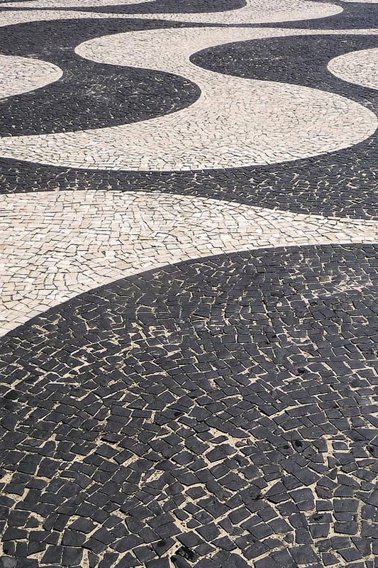
Copacabana
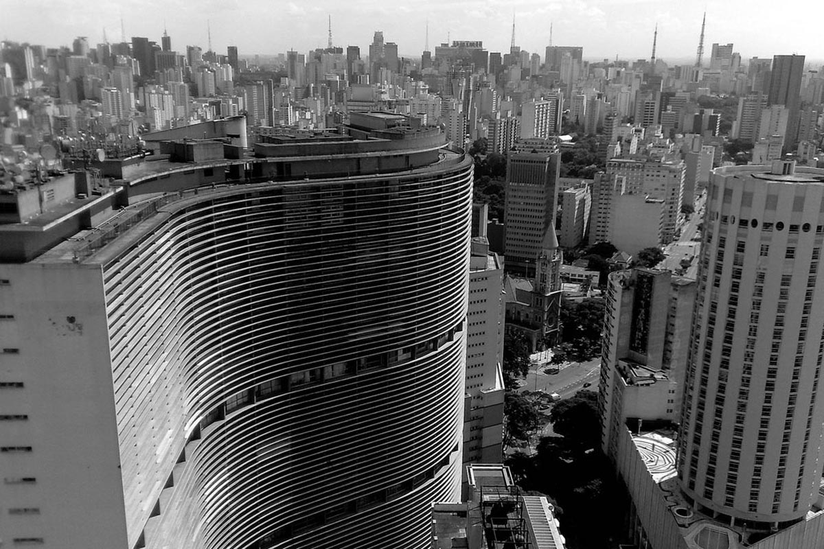
The Copan is an unique building, in its enormous size (it has its own postcode) but also in its social relevance. It houses a mix of different social classes in a true microcosm of Brazilian society.
We named our typeface after it, and our small homage was complete when Wallpaper used Copan once again on a special issue commemorating Oscar Niemeyer’s work after his death in 2012.
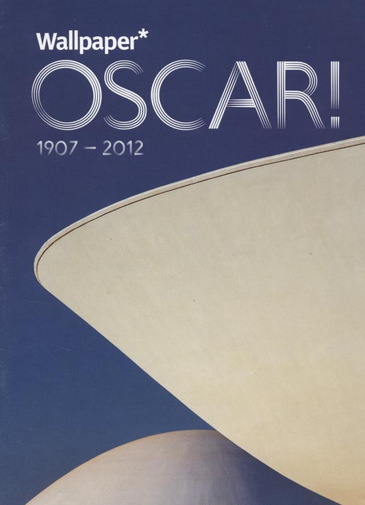
Wallpaper Oscar Niemeyer special