Fourth Plinth
Designing
all Levels
Shortly after we started working with the ICA, they offered us the opportunity to design every aspect of an exhibition. It was a unique opportunity to make sure that every element would complement each other.
It is common practice in England to partner up architects and graphic designers for designing exhibitions. Architects are responsible for general concept, selection of materials, budget management, lighting and build supervision, whereas graphic designers provide visuals for the identity of the show, text panels and caption systems. Situations like these are one of the few where we collaborate creatively with another practice.
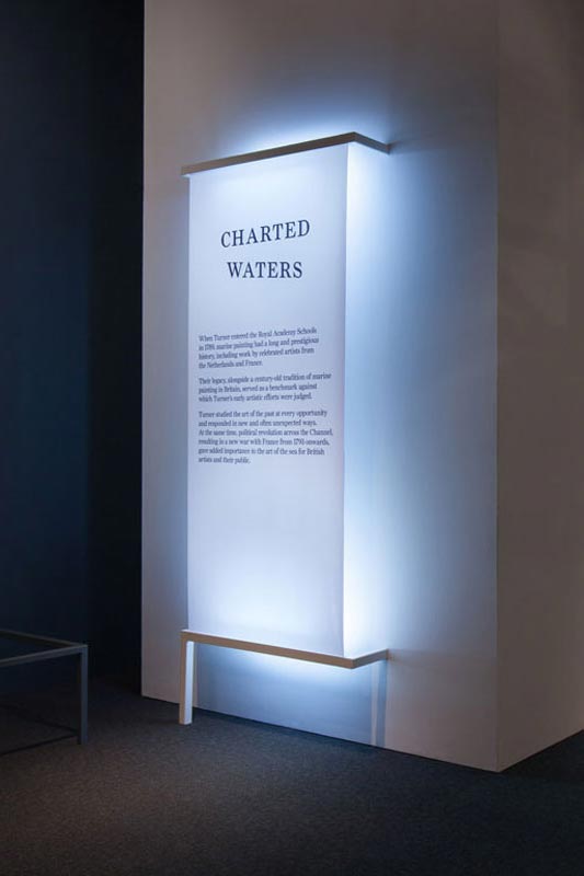
Panels for Turner & The Sea, National Maritime Museum
Working in close contact with architecture studios revealed to us the particularities of designing spaces, and how to manage an installation from its conception to final build. With each collaboration we had a better understanding of the process, the materials, and equally as important, the language and methodology of architecture.
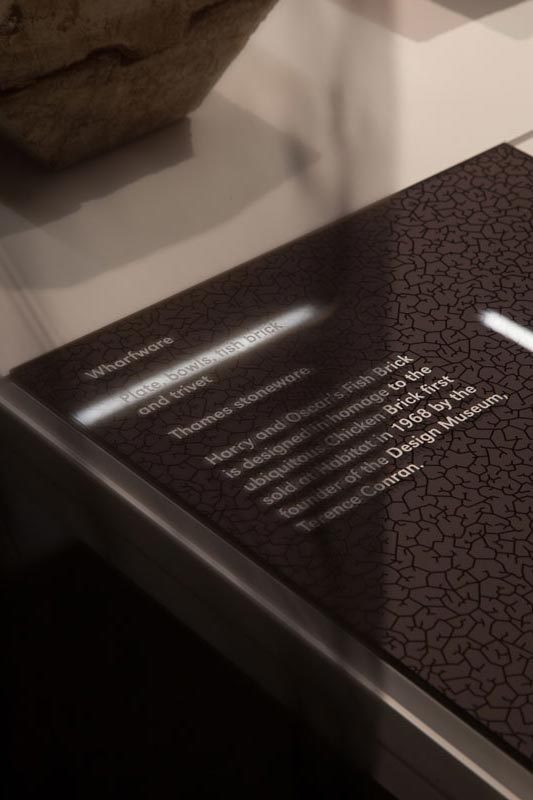
Captions for Designers in Residence, Design Museum
As interesting as these collaborations can be, we often felt a degree of frustration in having to stop short the creative process. In our practice we often find ourselves in a situation of exploring what lies beyond the institutional walls of graphic design; when designing a book, for example, we take interest in the editing, the way texts are written and organised, the photographic language, the packing and distribution.
It’s natural for us to operate in this same way when it comes to exhibition design, where the creative process of designing a title piece includes thinking about the space that it occupies, how it relates to the artworks around it, what role does it play in the narrative of the show, which materials it’s made of, and before late we’re thinking of the exhibition as a whole.
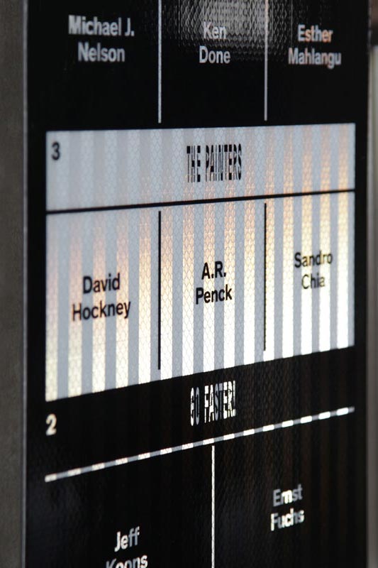
Panels for Art Drive!, collaboration between BMW and ICA
Eventually we felt comfortable to take the leap and design an exhibition from start to end. The opportunity came through our partnership with the ICA, when they were preparing to host a show for the Mayor of London’s Fourth Plinth programme.
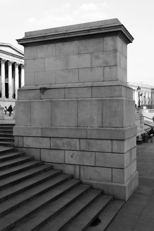
Fourth Plinth, West view
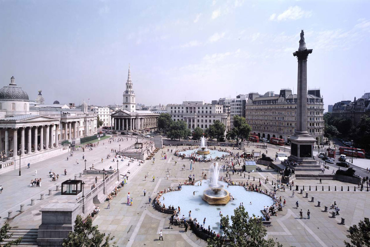
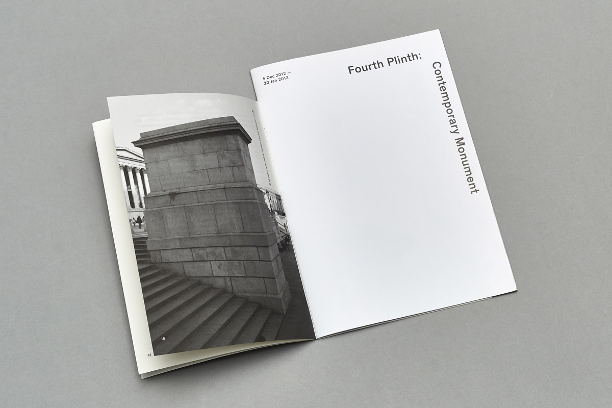
The Fourth Plinth is an empty plinth in Trafalgar Square (the other three have statues on them). It has been unoccupied for 150 years but since 1998 different public programmes have made it a platform for contemporary sculpture.
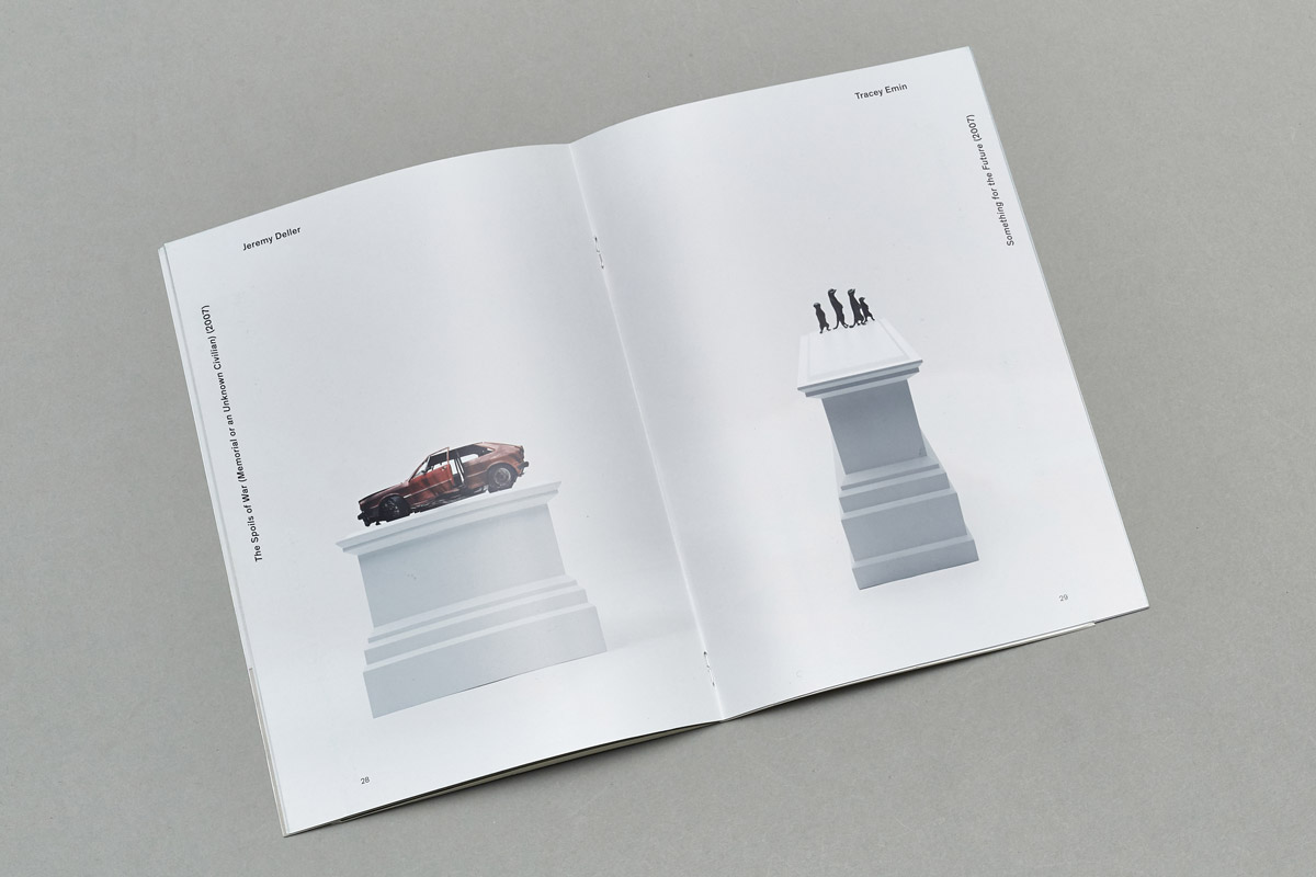
The current programme works like this: a small scale model of the plinth is sent to artists, who submit their proposals as maquettes that are later exhibited to the public. The selected proposals are built and installed on the square for a temporary residence period. The exhibition at the ICA was the first time all maquettes would be displayed together.

Press reaction to first artists’ proposals
We started by studying the original site of the plinth and how to incorporate aspects of it into our design. Trafalgar Square is an interesting space, a mixture of commuters and tourists either rushing somewhere or leisurely sitting on the stairs that lead to different levels and different view points, all surrounded by heavy London traffic. We thought that this was something we could explore, but at the same time we were conscious of not being too figurative in our approach.
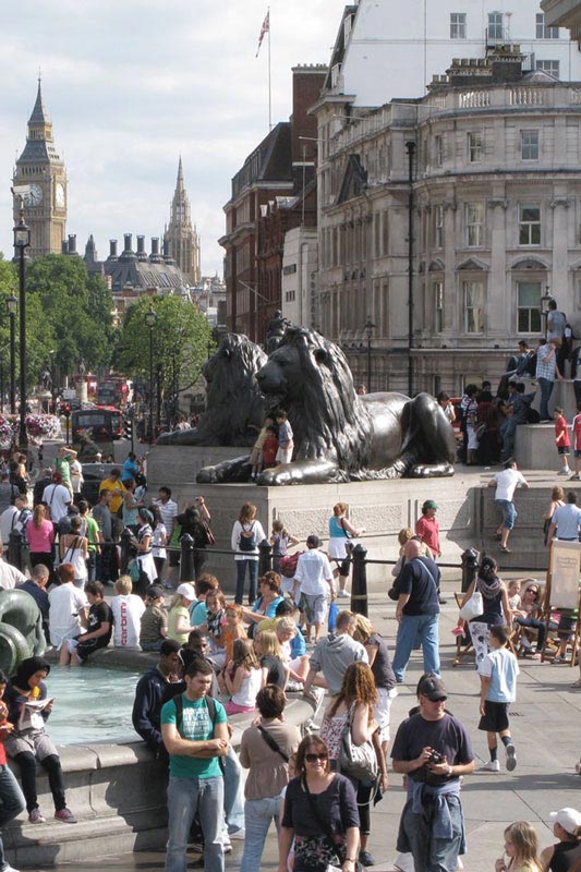
Trafalgar Square on Summer
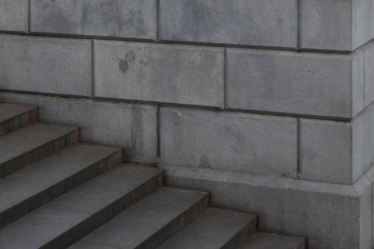
This is often part of our working process. It’s important to us that our decisions are grounded in the subject we’re working with, but at the same time we’re wary of crossing the line between reference and parody. The fact that this program is in this square, in this city, instead of any other square in any other city is important. But building a reduced version of said square in the gallery isn’t important.
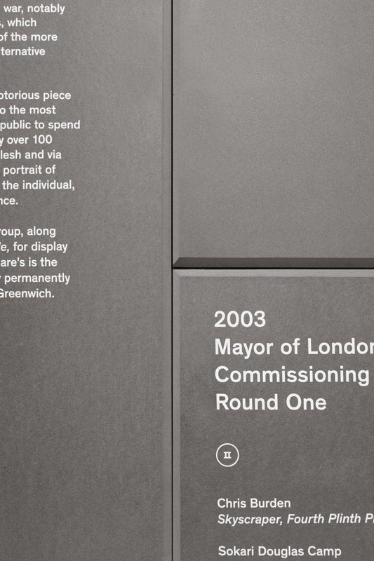
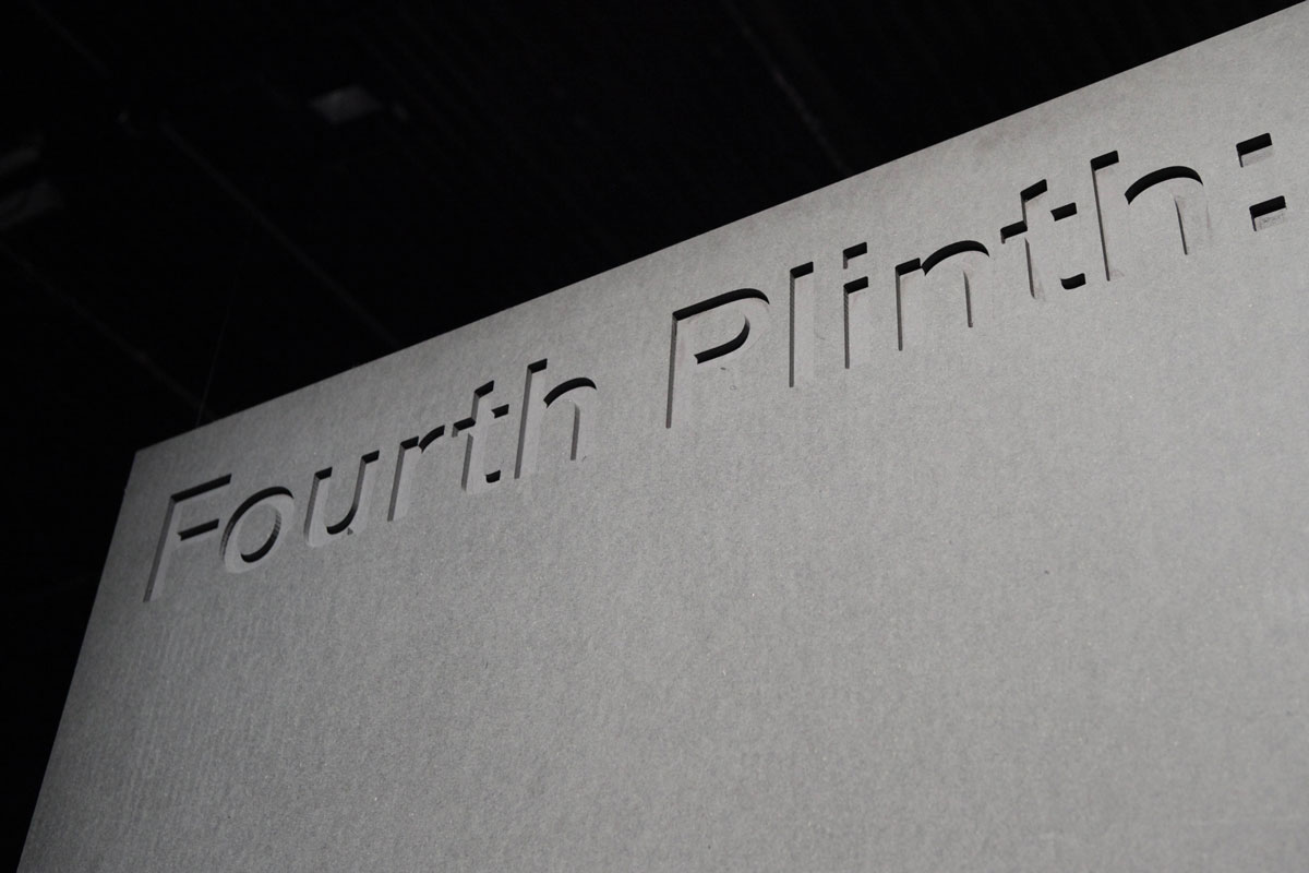
Detail of exhibition panel
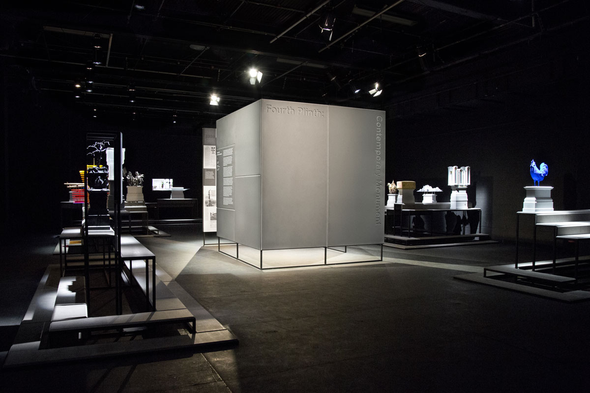
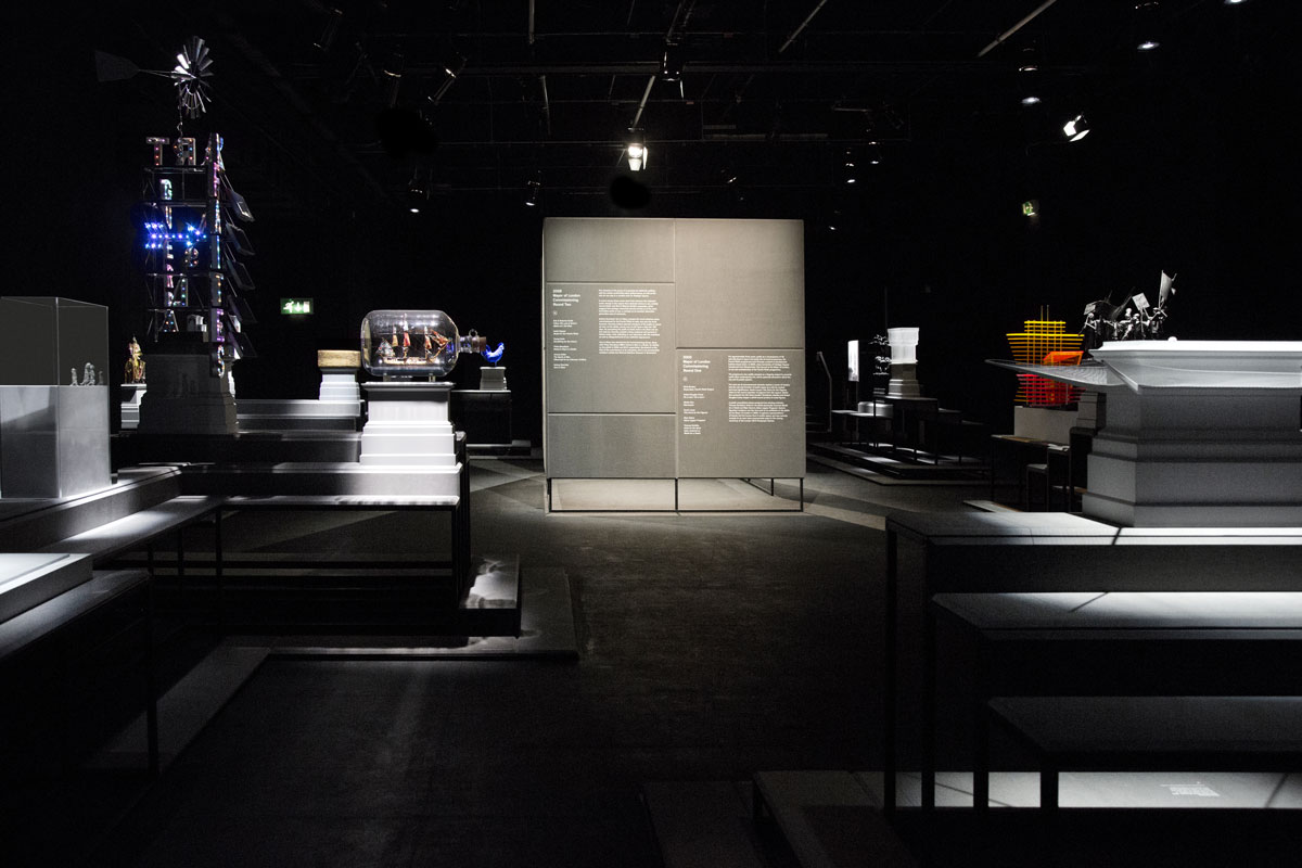
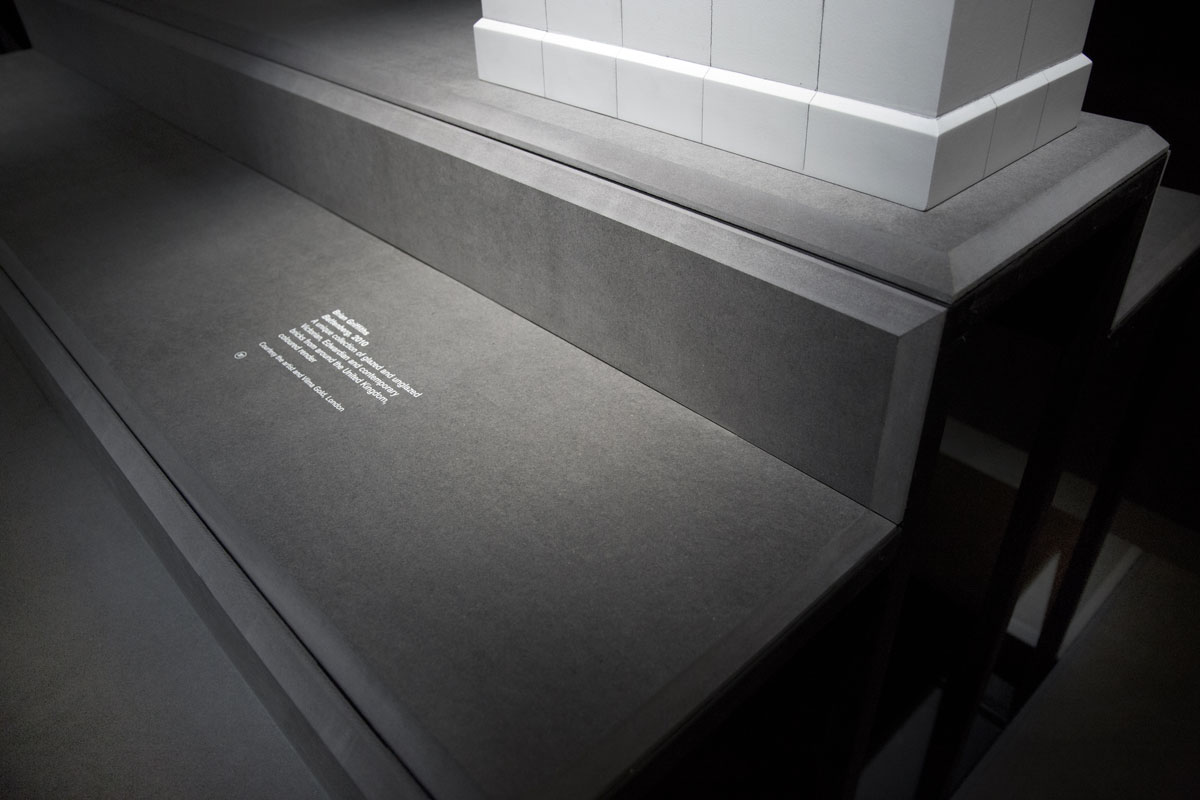
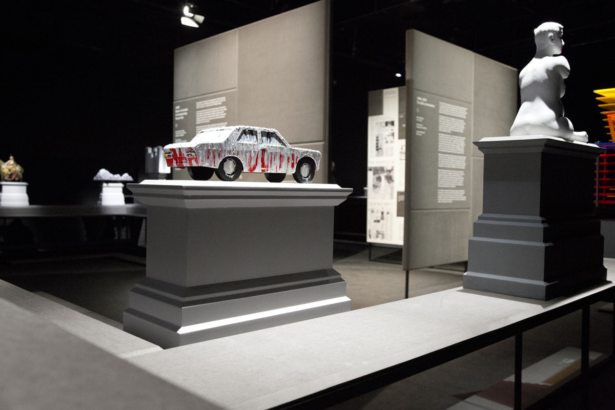
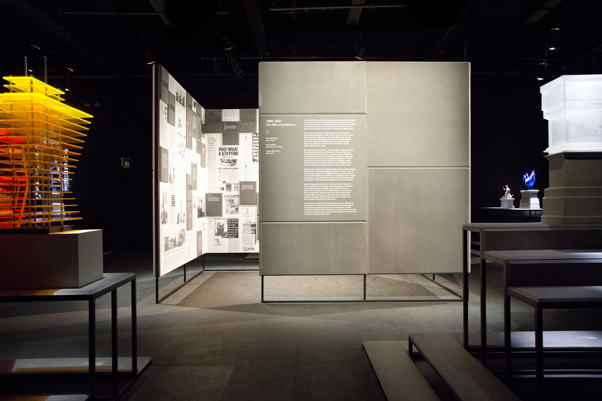
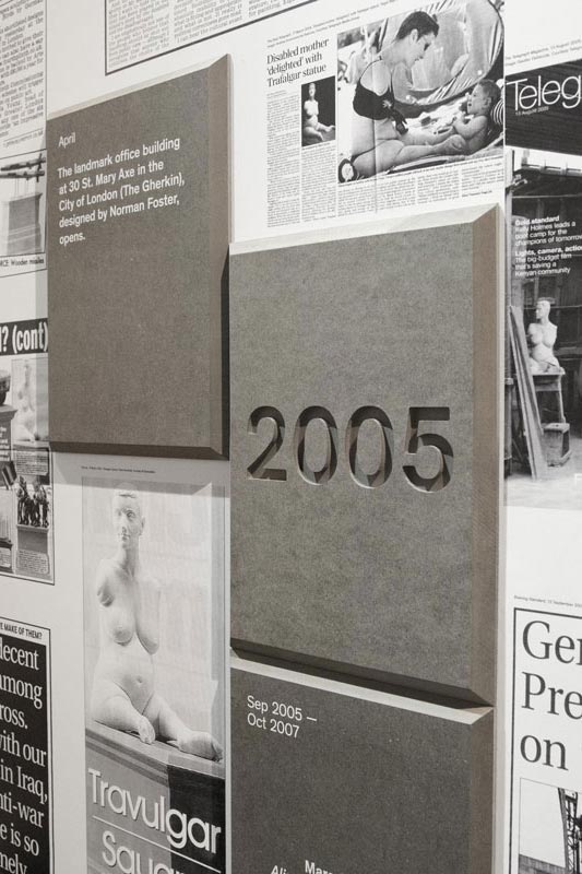
Our design features a set of modular structures spread around a central room. The surfaces are made of grey MDF, with edges finished at a 45º angle, echoing the concrete slabs that dominate the original site. To offset the heavy appearance of these structures the legs are built in metal frames, then painted in the same black as the walls to minimise its visual presence.
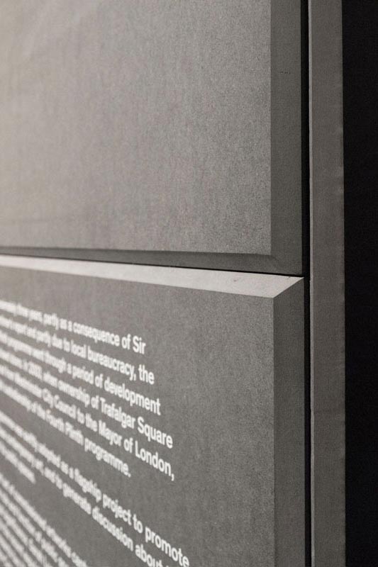
Detail of exhibition panel
The structures have different levels in something akin to inverted stairs: instead of us going up and down around the sculptures, they do it around us. That helps offering multiple viewing points but also to control the viewing experience; we could place the bigger maquettes on lower levels and the smaller ones on the top steps, thus levelling them. These steps also continue on the floor, providing a restriction area that protects maquettes without having to encase them in glass boxes.
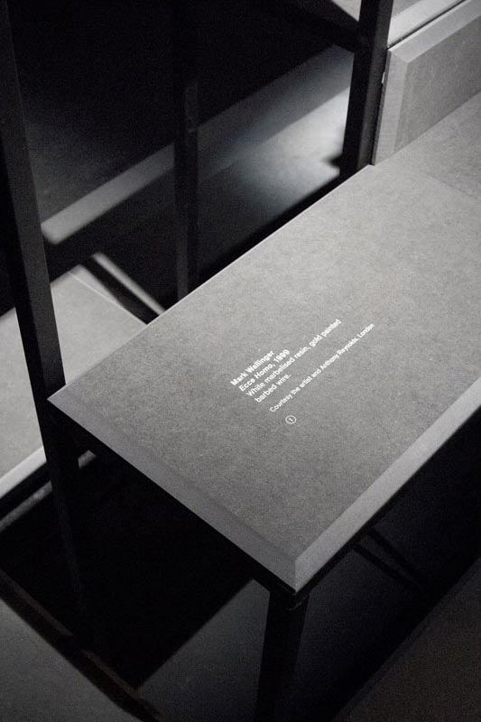
Caption
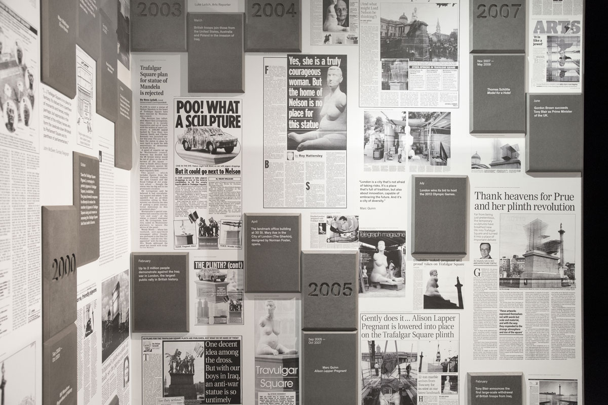
Being a public programme, Fourth Plinth generates considerable debate and opinionated articles on newspapers. This was reflected in the walls of the central room, where a timeline shows the press coverage and public response alongside key events in London during the period. Separating this material in its own room provides an opportunity for the visitors to view the artworks without interference from the noise of opinion, at the same time offering context for the artworks.
Caption
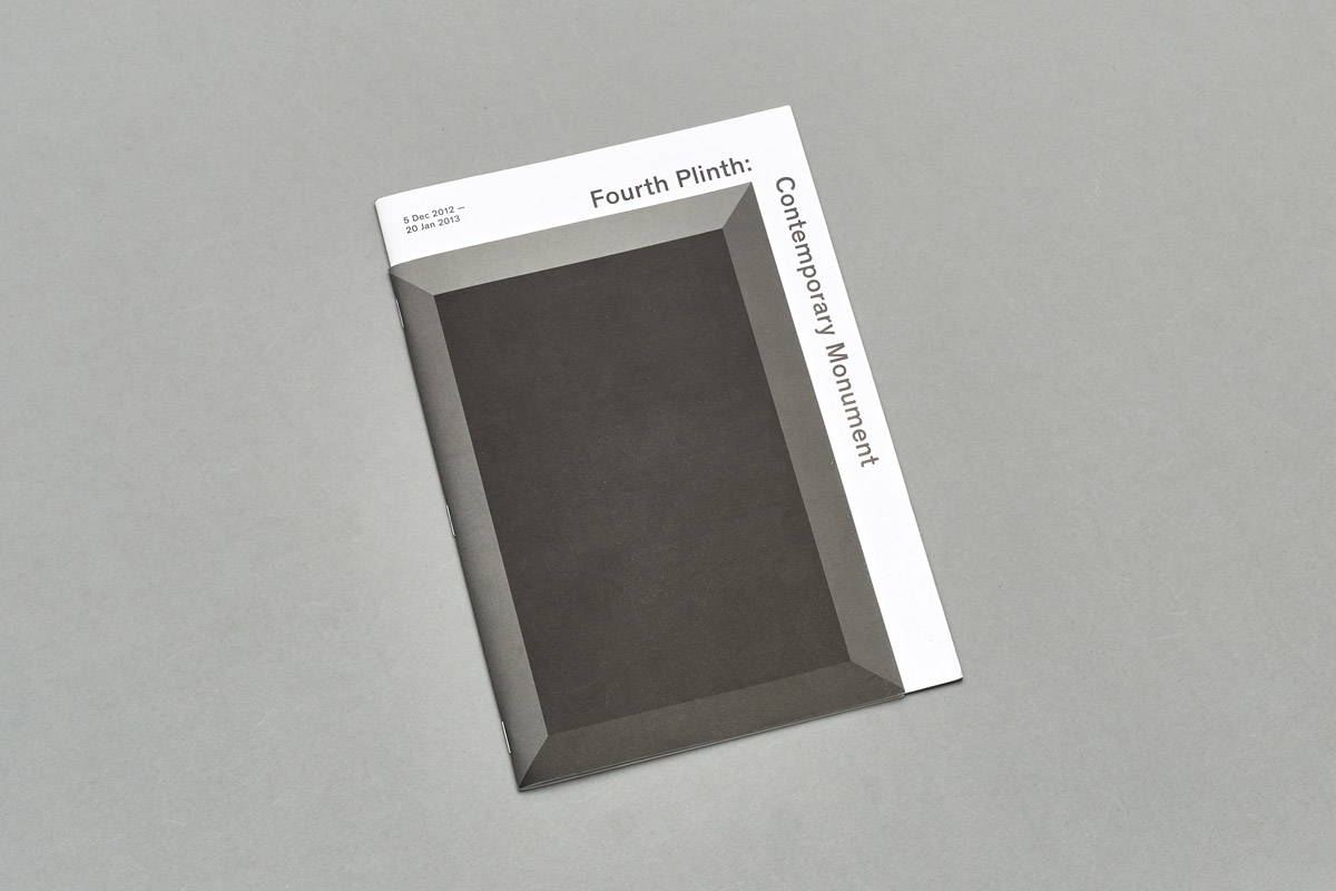
Similarly to the design of the structures the graphic identity used a stylised rectangle with 45° angles. This image can be read as the empty plinth viewed from the top, or as one of the building blocks that surround the square.
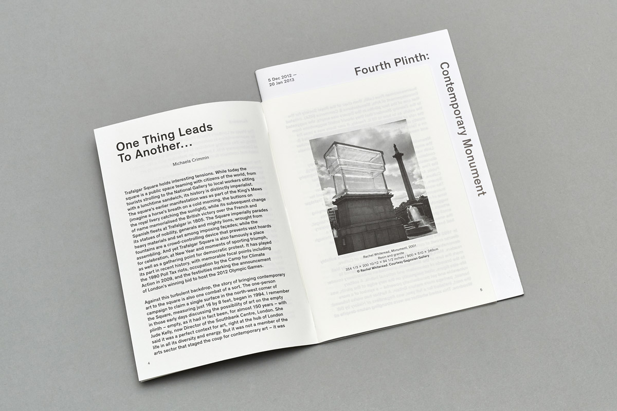
This image was used throughout the promotional material in adverts, invites and exhibition catalogue. The latter is designed as two publications bound together, a monochromatic version with essays and historical background, and a larger booklet in colour presenting the maquettes.

