Space Craft
Revealing
Space
“The work is architectural in an abstract sense, playing with space and movement, often lyrical and poetic, and inspired by Goethe’s description of architecture as ‘frozen music’”.
When we were at the Royal College of Art we made ours the task to design an exhibition of the class’ work in progress. As is the norm in these cases, a committee was organised to discuss the placement of each student, how much space each would get, and how the work would be presented.
As is also the norm in these cases, people were protective of their interests and pushing to make the exhibition suit their specific needs. There’s nothing wrong with that, naturally, but if everyone had their way we’d end up with the lowest denominator: white walls, some work hung, some displayed on white plinths, some on monitors. Surely that can’t go wrong when there are different needs to accommodate.
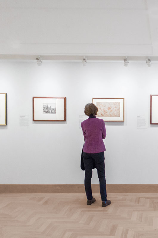
An exhibition
But that’s very close to doing nothing, and doing nothing is not necessarily the best way to present work either. Our theory was, and still is, that if the overall exhibition looks interesting, the individual works will look interesting too. This is not to say works are displayed poorly in the name of a greater good, quite the contrary, we think that some level of interpretation is necessary to contextualise an artwork in an exhibition.
Our work in progress exhibition was resolved as a continuous table snaking through the gallery to support the different works. It was relevant at the time, given that the desks were our natural habitat during college years, and the exhibition served us well. The lessons in organising it too.
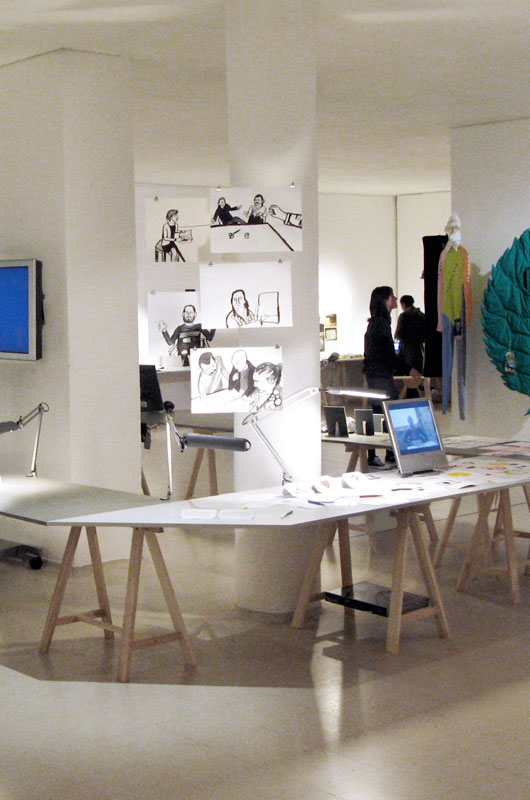
RCA Work-in-progress, 2007
We put some of that experience to use years later, designing a group exhibition for the Crafts Council. Titled Space Craft, it focused on architects and designers who apply their craftsmanship in works that relate to space. Hence the opening quote, taken from the client’s briefing.
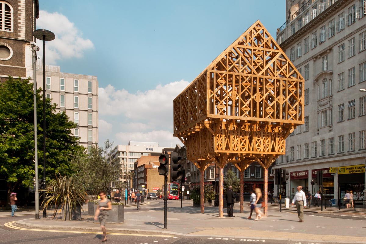
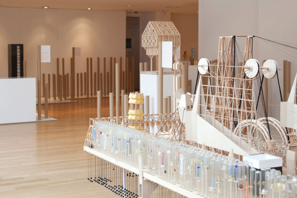
The selection of artists was varied, including ceramics, metalwork, jewellery, wooden furniture, a public sculpture, and a large central piece that should probably be described as a maquette.
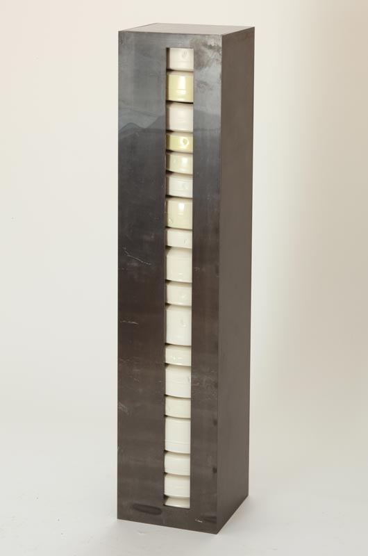
Edmund de Waal
In our view the exhibition would benefit from a strong presentation that weaved these pieces together into a larger fabric. We also thought that we could do something with the exhibition design that would illustrate the curator’s statement. The exhibition itself exists within a space, so why shouldn’t it relate to this space in its own way too?
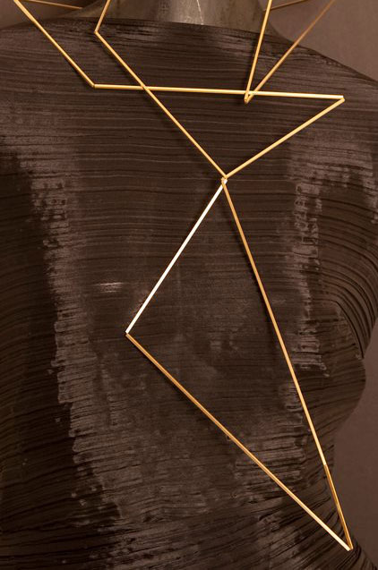
Ute Decker
The idea was to make visitors aware of space, to render it visible. It’s an interesting proposition because space is one of those things that is defined by the absence of something else, like silence. It’s also ever present, we’re all in some space all the time, which makes it difficult to make it a visual subject.
Imagine a large empty room, for instance. It looks more empty if a solitary chair is placed in the middle. But in the context of an exhibition, then it is the chair, not space, that is likely to be perceived as subject. It’s easy to see why artists that make installations on this matter resort to non-figurative interferences in the form of lines and light.
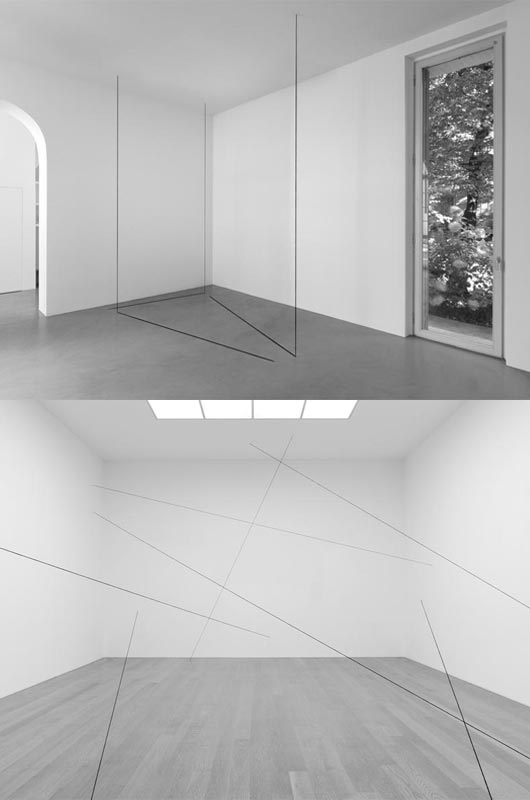
Examples of Fred Sandback's work
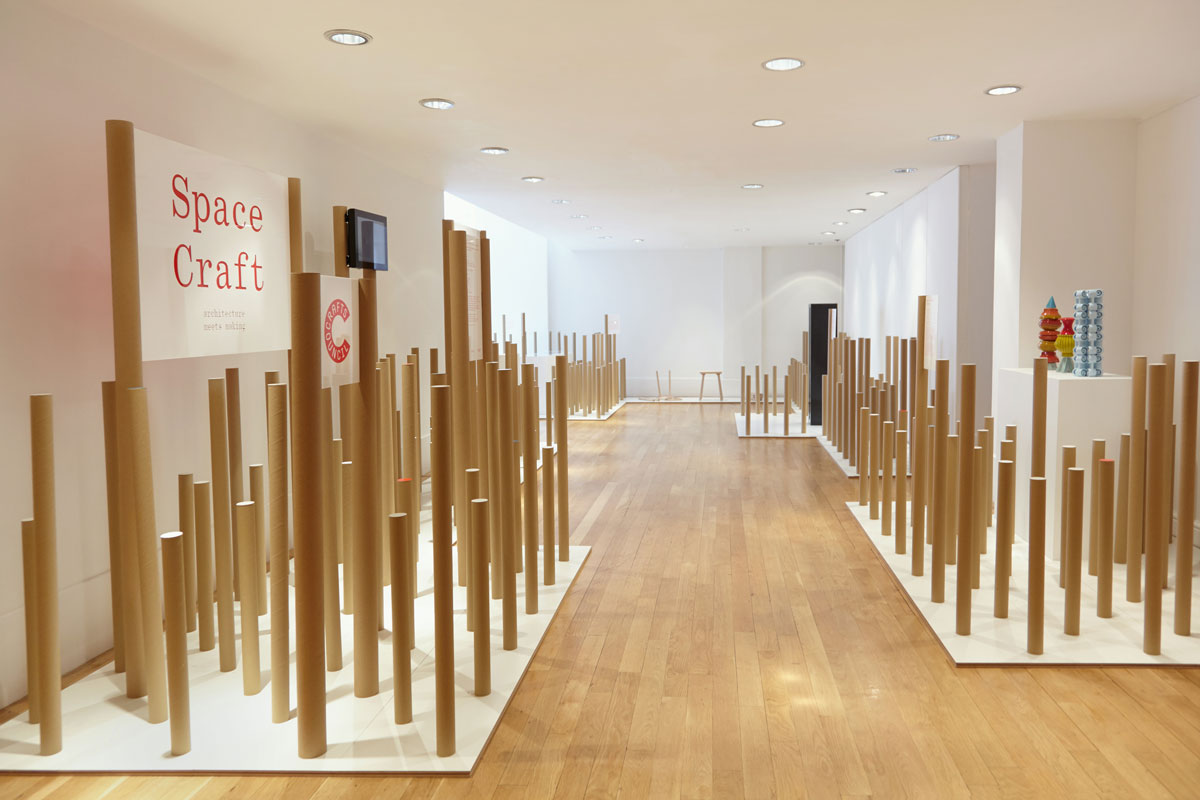
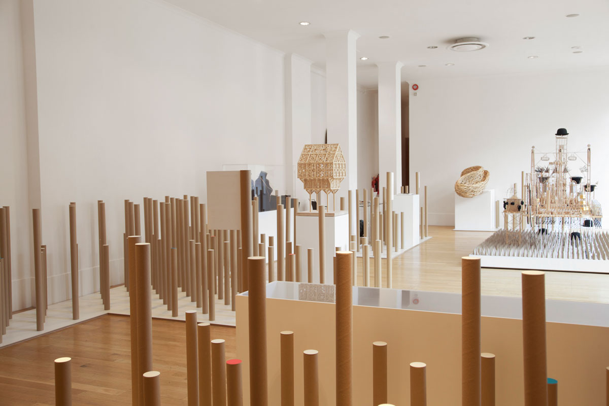
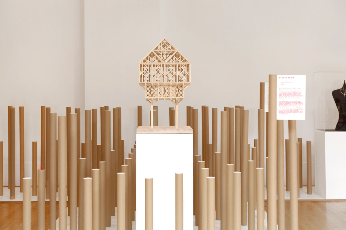
Taking cue from the beautiful ‘frozen music’ expression, our proposal followed a similarly abstract path: vertical columns protruding from the floor in a modular grid. They fill the space between exhibits, creating partitions that hide and reveal the artworks. Walking among the columns is like being on the road and driving by a pine forest, the tree trunks coming in and out of alignment, revealing spaces and filling them up.
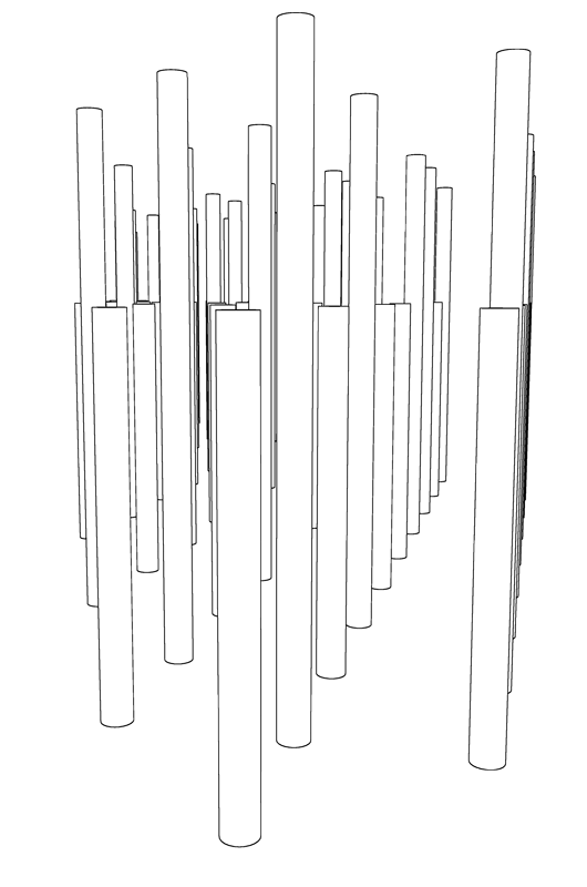
Sketch for exhibition design
The columns are made of postal cardboard tubes, cut to different lengths. They hold the captions, introduction panels, and make up restriction areas so visitors can’t touch the artworks. There is more than one reason for using a cheap everyday object like the postal tube, cost efficiency is one of them but also we like the act of transforming a banal object into the centrepiece of an exhibition.
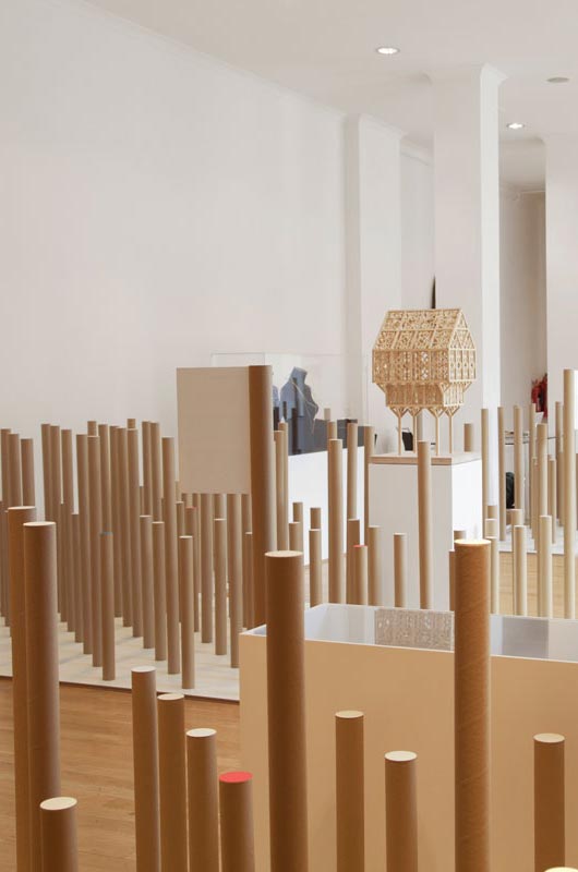
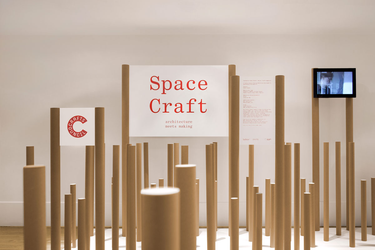
An object like that carries with it its original function, which usually dictate its appearance. If we’d have custom-made columns, for instance, we’d not consider having them painted in brown. But the brown of the tubes doesn’t read exactly as a colour, we’re so used to its appearance that it looks neutral. It looks like material, not finishing.
Our only change to their appearance was to make bespoke lids that sit flush on the surface. This breaks a bit of the object’s familiarity, and adds refinement and appropriation. These are now Space Craft’s tubes, not any tubes. Most of the lids were white, but some in colour to create occasional highlights.
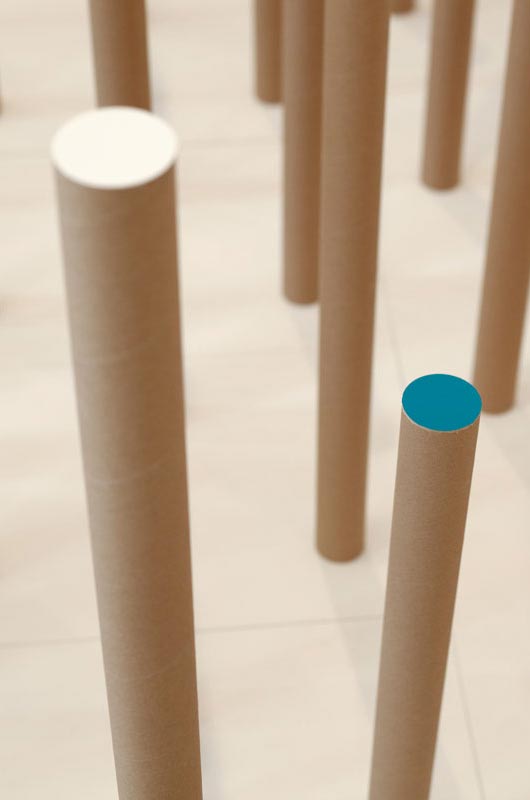
Detail of postal tubes and lids
One more benefit of using the tubes is their lightness. The exhibition would travel to different galleries in the UK, so it needed to be packed and transported efficiently. An object designed to be shipped could only help.
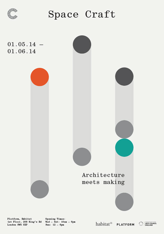
Poster
The challenge of making a traveling exhibition is that it needs to be as self-reliant as possible. Some galleries might offer possibility of hanging things from the ceiling, others not. Some might have walls that hold plenty of weight, others not. Some will have concrete floors, others wooden; some will have natural light, others not.
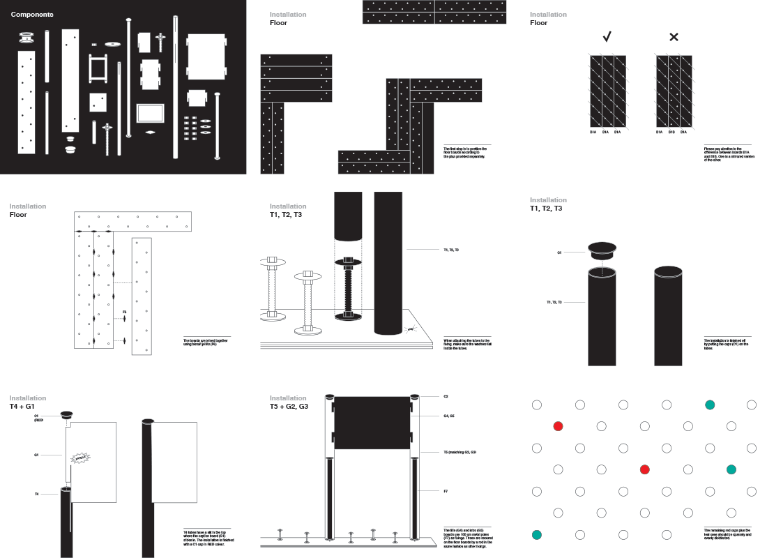
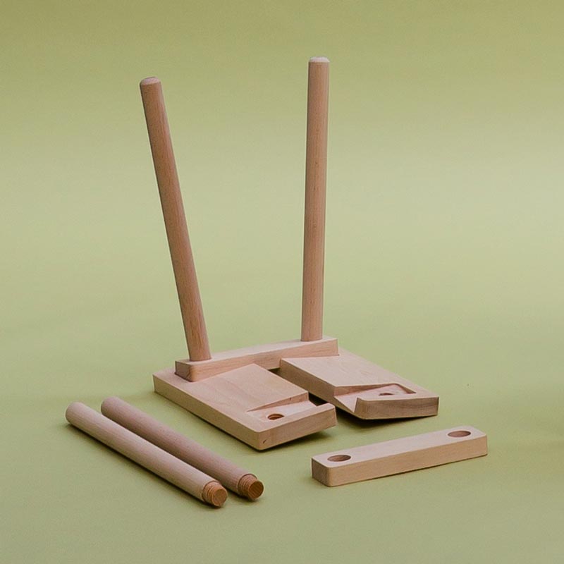
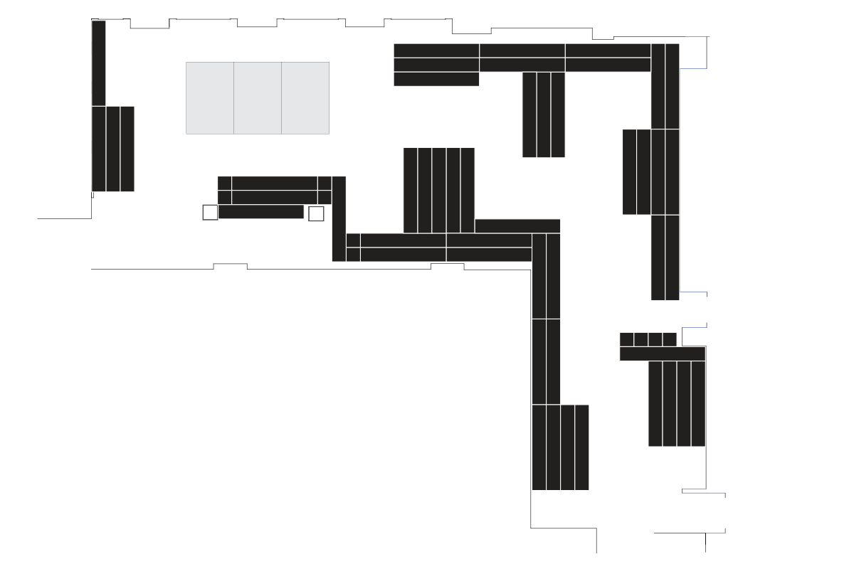
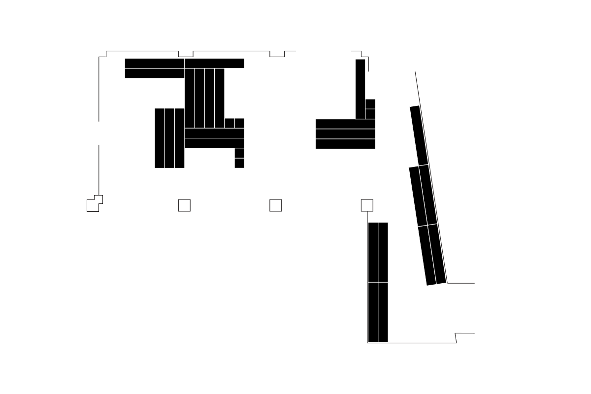
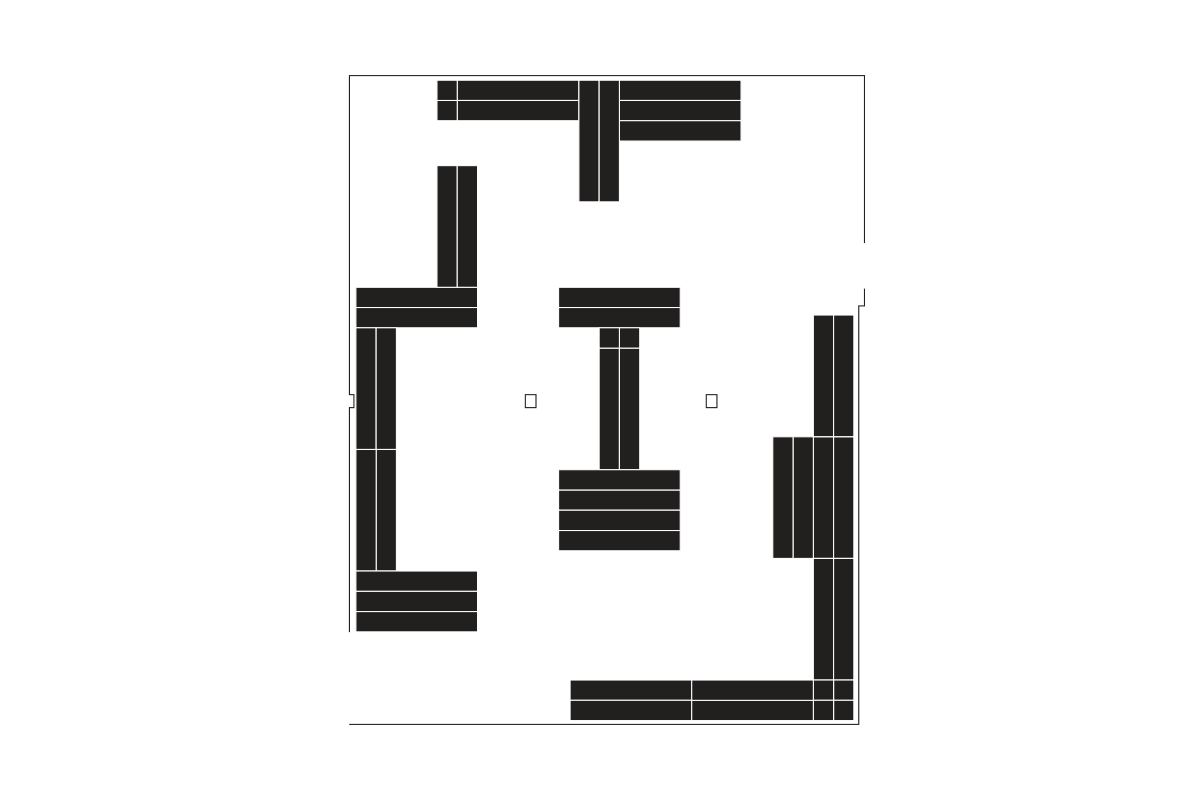
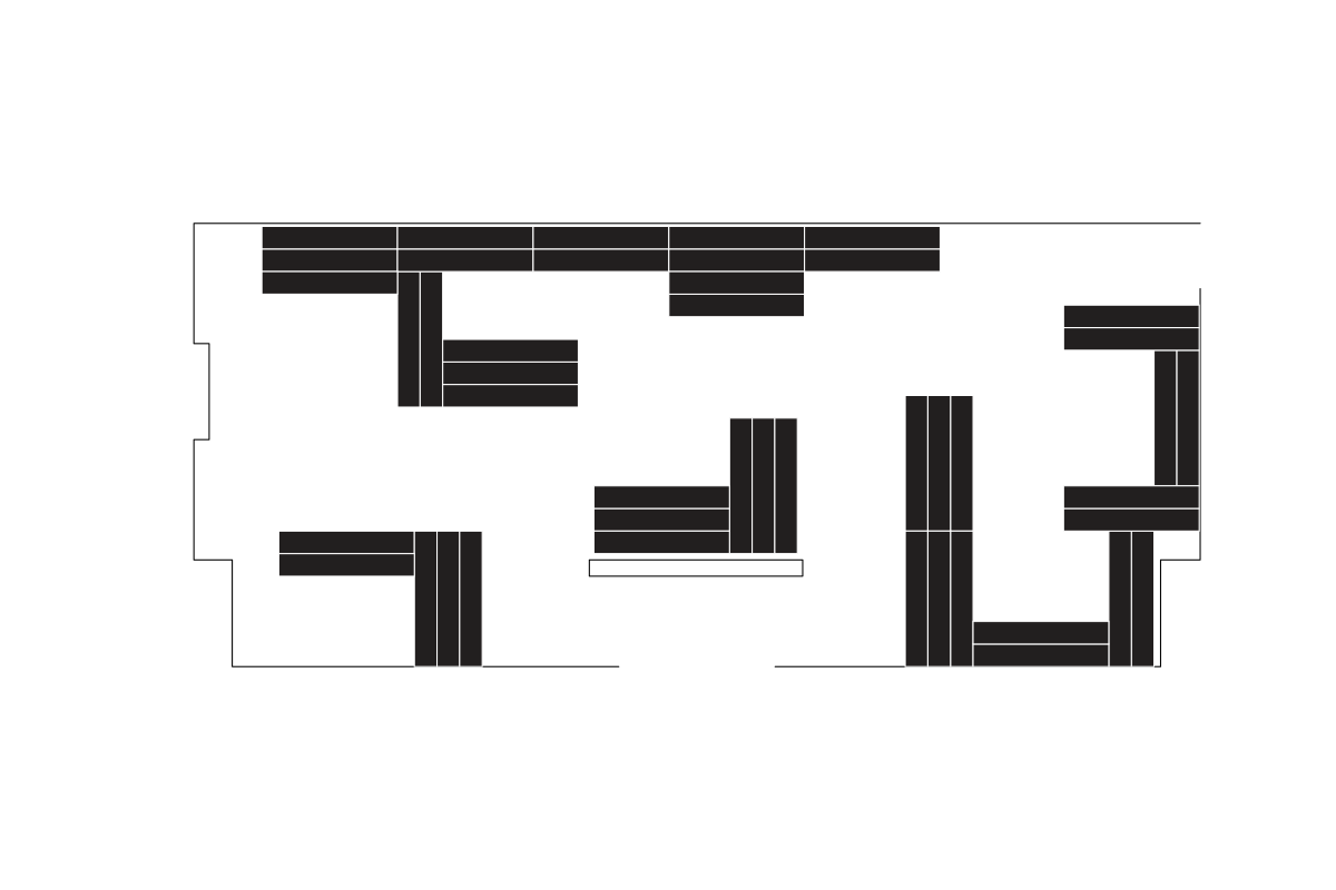
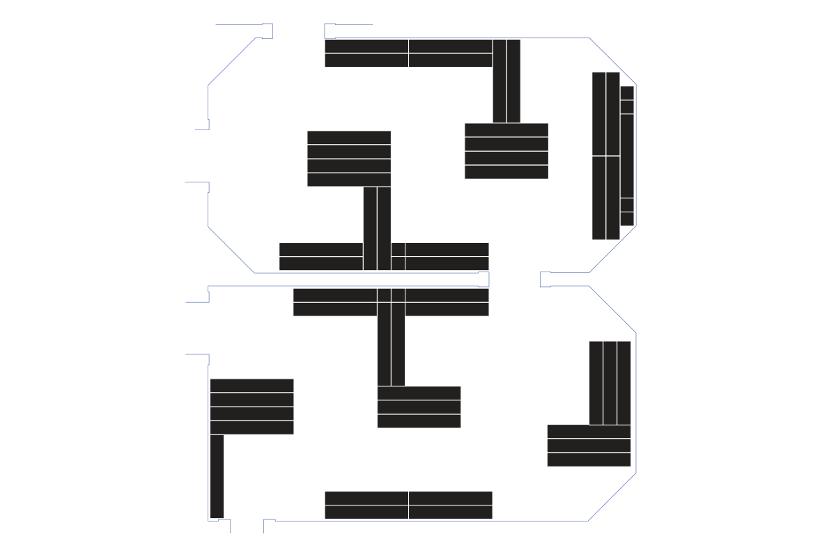
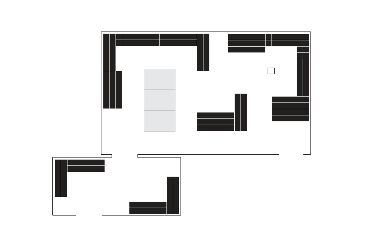
This means we had to make our own floor to which the columns would be fixed. It’s made of narrow boards, allowing us to change the layout according to different rooms. In its travels, Space Craft visited 7 galleries varying from 20 to 100 square metres. All we have to do is provide a layout for the floor boards and a build manual, and the exhibition will be ready to be installed.
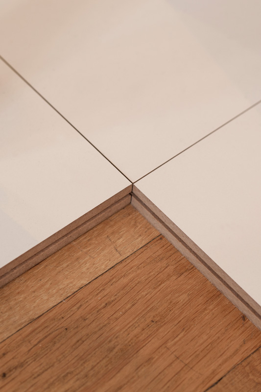
Detail of floor boards
